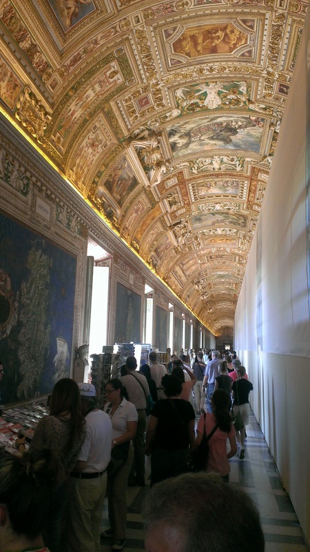
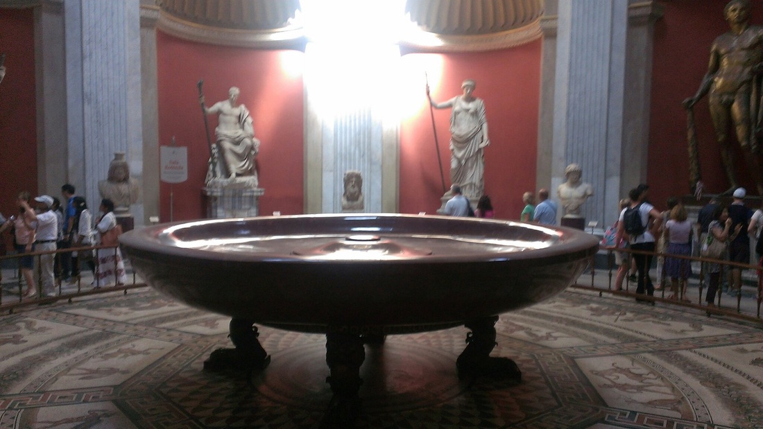
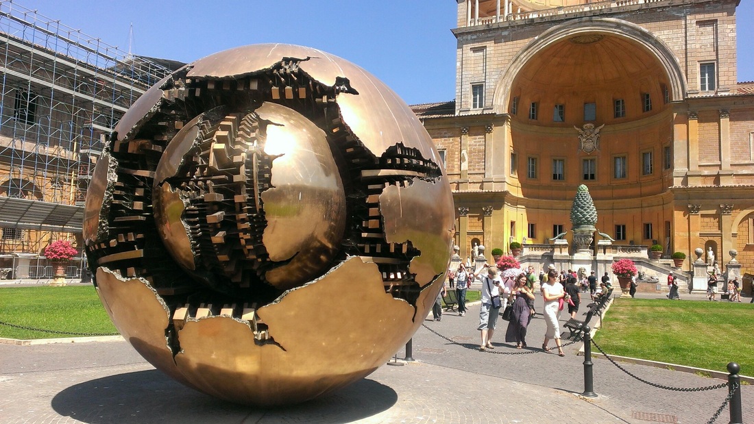
As I walk into the Vatican Museum, I was expecting to see only one great piece of artwork which is the Sistine Chapel. What a surprise that was bestowed upon me as I was searching for this one particular famous work of art! First off, the sphere within sphere sculpture by artist Arnaldo Pomodoro is a more modern piece of work that got my brain warmed up for the onslaught that followed. I viewed Arnaldo's sculpture as a foreboding piece of future events. The mechanical designs within the spherical shapes present a tale of inner destruction within, what I viewed as, two worlds colliding. I had no idea that almost every room within this place was teeming with so much artwork!
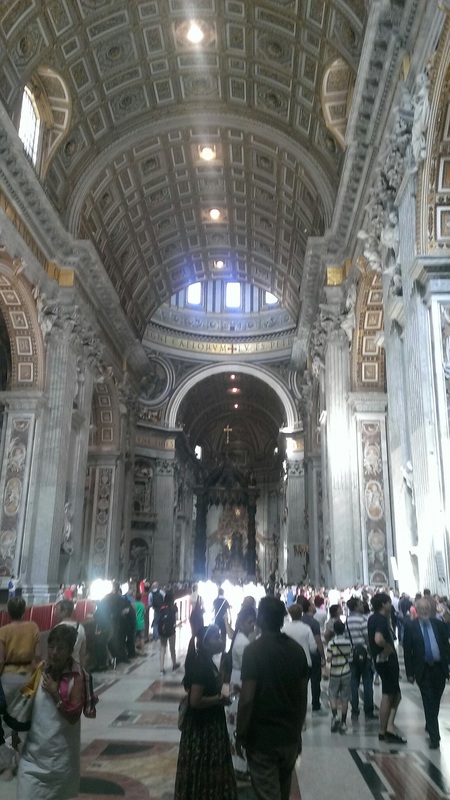
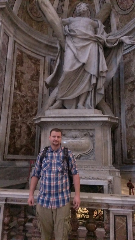
The Basilica is overwhelmingly ornate! On the outside, there's statues lining the top, which is awesome to see, but a shame not to be able to observe up close. Going inside, I felt an immense surge of epic proportions! Everywhere I looked, my eyes were flooded with all kinds of artwork! Sculptures, statues, and designs covered every square inch of this place. It was a great deal to absorb in such a small amount of time. I can't imagine attending a service and not being distracted by such a large amount of historical artwork.
I was trying to remember what the Gaurds at the Basilica were called earlier but couldn't think of it while I was there! The Swiss Gaurds make up the smallest army in the world....and yes, they are all Swiss! I wouldn't want to mess with these guys because they are highly trained. I was wondering why the obelisk looked Egyptian, and that's because it was taken from Egypt! The Vatican City is actually a city-state consisting of about 600 citizens that live abroad. Researching the history of the Vatican makes it seem a little less holy moly and more like a type of empire!
Up early and ready to start the day. Had a ham and cheese sandwich and eggs for breakfast which was pretty tasty. Heading to Vatican City and I am pumped to see the Sistine Chapel. I can't wait to see all the other amazing works of art that are spread about!
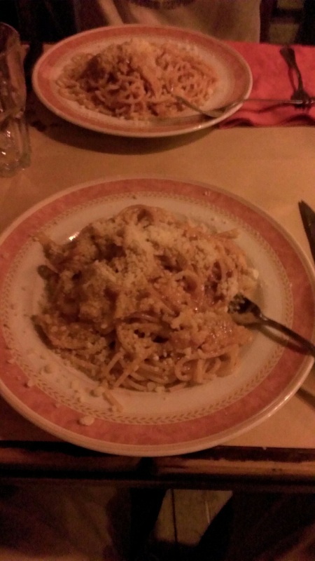
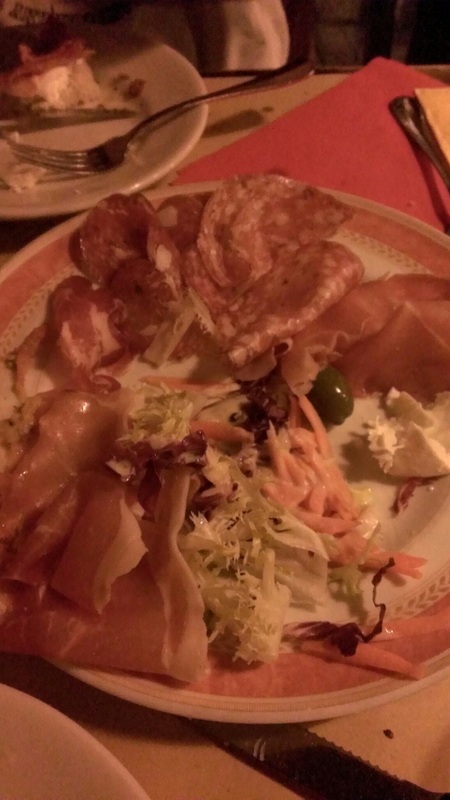
The food here has been AMAZING! The food tastes so fresh and it's prepared when ordered! It's no wonder people flock here and vist the restorantes! I'm also a big fan of cheese, and the types of cheese used here in Roma are absolutely wonderful!
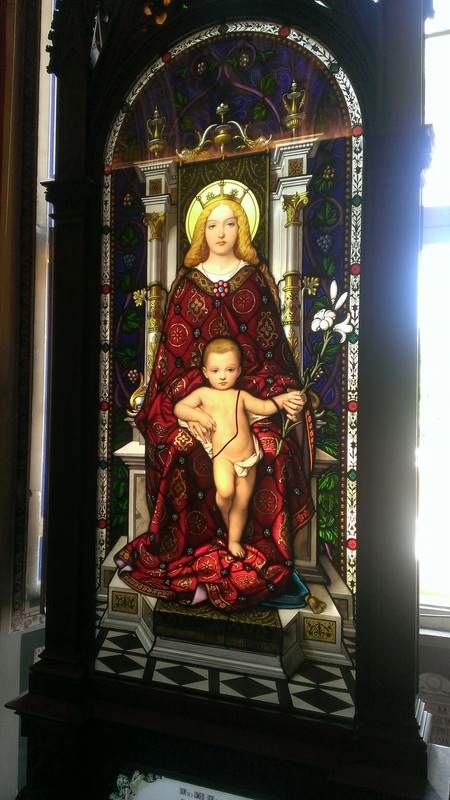
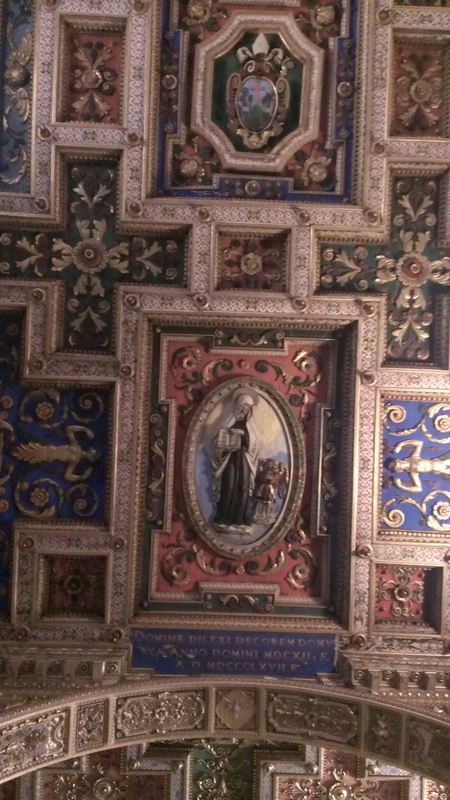
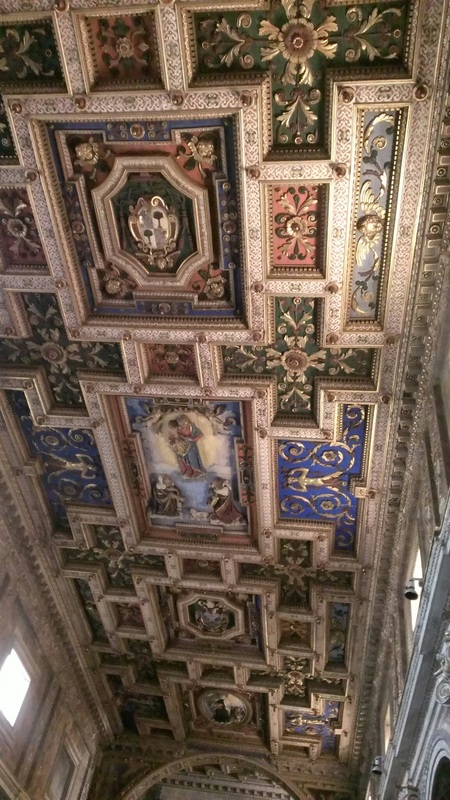
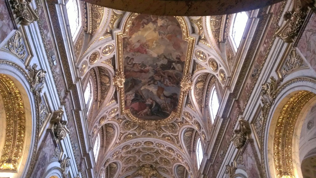
The churches that I have visited today are gorgeous! The designs and paintings are so elaborate and beautiful! The detail and amount of work put into these buildings is astonishing! The artistic value of these huge churches is priceless! The artwork and architecture really strike an emotional nerve. It would be no surprise to see how faithful and devoted the members of these churches are because the the amount of artwork could make anyone a believer!
The ride on the plane was long and uncomfortable, but whatever gets me there is alright I guess. Wow! What a great first day in Roma! The massive structures and sculptures are breathtaking! Seeing the Colloseum really made me imagine what it could have been like centuries ago when everyone in the city gathered to watch a potentially fatal spectacle! I've learned a great deal about customs and traditions in the Marine Corps, but Roman history dates back a lot further. It's hard to imagine growing up in a city so rich in history! I'm going to have to do a lot of research because I'm trying to figure out how some of these sculptures were made and placed where they're at! This is such an amazing experience, yet there is still so much to see!
Marisa Merz
Art looks rough and textured. Appears to be charcoal and some types of crayons. Compositions are abstract and vary in symmetry and color. Sculpture seems to be wrapped in paper and the silver objects act as a focal point. Walter De Maria The composition is very structured, but the use of angles creates an asymmetrical balance. Varda Caivano Abstract compositions that use color and line to create forms and depth. Looks like conte crayons or water downed acrylics were used. “Kamikaze Loggia” The building has economical elements that reinforce the outer look of the building. The mounted car stereos are chaotic compared to the wire frame structures. Enrico David Uses different colored fabric that is woven together to create repetitive designs. The sculptures and drawing compliment each other so well that it creates a type of odd world. Henrik Olesen Uses pictures, texts, and space arranged to create compositions. Minimal color is used to add variety in the compositions. The two boxes have different meanings as one is filled with sanitary objects but the other has a cigar in it. Sarah Lucas The reflective surface of these sculptures allow the light to add movement within the pieces. The sculptures appear to be abstract renderings of human form. James Lee Byars I'm not sure what the initials stand for in these sculptures, but as the viewer, the letters create a type of memorial out of these. Mark Manders His sculptures create contrast between organic and mechanical elements. The one sculpture looks huge which reads as a face in a bookshelf. Carol Rama Uses watercolors to imply shapes of people in various positions. The different frames used add character to the individual compositions. John Bock The house looks a little creepy. The house is huge compared to the central focal point to which it encases. To me, it represents making a big deal out of something small. Hans Josephsohn These sculptures seem to resemble ancient artifacts. The artist has created pieces that appear to have been around for ages. This technique adds mystery and leaves the viewer figuring out what the piece might have been at one point. Danh Vo This setup works as a type of religious shrine. There is repetition of crosses in the shrouds and structures in the beams. The crate with writing adds a modern feel to the room. James Richards Not sure how he made the eyes. They look very detailed using cross-hatching and lines in some sort of material. The pictures are scratched out, maybe to invoke thoughts of wrong or bad. Daniel Hesidence The use of white lines to bring out forms against the monochromatic backgrounds gives the compositions focal points. It's interesting because it reminds me of making constellations out of stars. Geta Brătescu The use of mixed media creates varying tones of the same theme. The forms remain similar, but different techniques are use to redefine each composition. Harun Farocki This video shows the interaction people have with monuments and the emotions that are attached. The people standing in the freeway is interesting and I didn't know that they did this. Helen Marten Some of the pictures look computer generated which makes me wonder if any of it is real. There's repetition in shape as in the upper-right door fixture. The faces resemble the shape of the object that they're on. Simon Denny Uses photos that are arranged to replicate the objects within the photographs. Shows how complicated something can seem without being real. Lynette Yiadom-Boakye Looks like oil paints were used to depict human forms. Edges of forms are rough and white shows through, maybe to separate the figure from the background. Jos de Gruyter and Harald Thys The video shows sculptures of human form. It shows how mundane conversation can be. Pamela Rosenkranz The audio makes painting sound very dangerous. The art looks like solid colors that has warped areas. The paintings depict what may happen to skin when paint gets on it. Trisha Donnelly The marble monument really pops out against the worn look of the housing. Makes me wonder why this piece is in the middle of this building. Rudolf Stingel The dark, intricate designs of the carpet give the white spaces a high contrast. Yüksel Arslan His art reads as a type of research of the human form. Some pieces resemble Egyptian hieroglyphics and tell some sort of story. Cristopher Williams The black and white photos of plants are arranged to make the viewer read the subject in a different manner than normal. Katrín Sigurdardóttir The elaborate designs create illusions and distort space from different angles. The lighter boards give the dark floors a border that makes it bolder. Lawrence Weiner Uses words to create formulas for the viewer to think about. The red lines emphasize a key word in the phrases. Mathias Poledna The small drawings are detailed and each one is different but similar to another. This look like a similar technique that is used Buona Sera! I'm getting pretty excited and nervous....just hoping I don't forget anything important that I may need. I feel so privileged that I'll finally be able to see, in person, all the wonderful works of art and structures in Italy.
|
 RSS Feed