My ideas right now are a painted series of something modern and recent..... and a sculpture of some sort... There are a few different things I could work with but I'm not quite sure, I still have a bit more to explore, think about, and a lot of brain storming to do. I'm not positive about the few ideas I have right now but, I'm going to start and see were the brain takes me after seeing almost all of Italy,... we shall see.
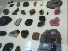 Roger Caillois (1913-1978/ France) Caillois had a stone collection that I found appealing. Each stone had a unique design, with different shapes and colors that he collected from different parts of the world. It is interesting that this science and passion of his partly started with the discovery of the Mexican jumping bean. 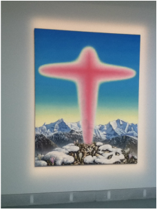 Jean-Frederic Schnyder (1945/Switzerland) The use of bright colors in his paintings seemed to have a lively effect. The use of the colors make his images seem realistic. This also helps him with his religious motifs that he is trying to illustrate. 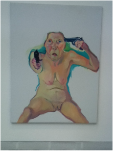 Maria Lassnig (1919/Austria) Her self-portraits or "body awareness paintings" are unique. Many people would not take the extra step and do these type of illustrations. The use of color to help emphasize the lights and darks in each portrait. 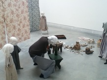 Cathy Wilkes (1966/UK) The found objects and sculpture used to illustrate different scenes are effective. The cloth is used to dress each sculpture and background to bring life to each of them. emotion is illustrated as well.  Gilad Ratman (1975/Israel) This is one of the most unique types of art work I've seen yet. Ratman had different artist to respond to unknown situations by using voice and self narrative. I still don't quite understand it all but I like this idea although it's a bit weird.  Terike Haapoja (1974/Finland) The fact that she uses science, technology, and nature to illustrate her work is interesting. In her work she shows veiwers how different parts of nature respond and operate with humans before and after life. This helps us to think outside the box.  Pietro Longhi (1707-1785/Venice) His paintings of/from the 18th century seem lively. You can almost tell the time of day with the use of color and light and dark areas within his paintings. You can also see detailed areas.  Giovanni Bellinie (1430-1516/Venice) Bellinie had a special technique of painting and using different material to paint wooden panels. He had his own way of creating paint that made his work unique. The color and material he used is what made his work effective. 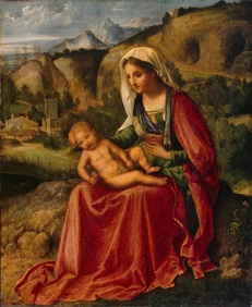 Giorgione (1470-1510/Venice) This artist did paintings on religious matters. The use of bright colors in his work to help him express the religion is effective. I'm glad that he was able to do the paintings that he did at such a young age. 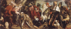 Paolo Caliari (1528-1588/Venice)
Caliaris' use of color and line to illustrate details in cloth and garments in his paintings made them effective. He also includes animals and other objects to make each portrait seem lively or realistic. He also illustrates emotion and movement as well. 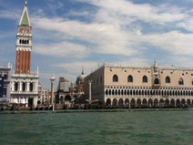 LAST BUT NOT LEAST! the Gallery, the Museum, the Biennale, the HDG Group VENICE was the best of them all the top of the top, another indescribable experience. First "Waterbus" ride The Biennale was way better than I expected seeing every single work Individually with my own eye and not through a photograph allowed me to think more and see areas of the art that I could not see in a photo graph. believe it or not I think I may have learned a few things from these artists just by OBSERVING their pieces. it is way better to see art work personally than through a photograph because if all is seen is the photo you may not get the full story and the meaning of the work that has been done to create that "ART". :) : ) : O !!! HDG was fantastic! I had now idea, the amount of companies they design for. a lot of information and work! 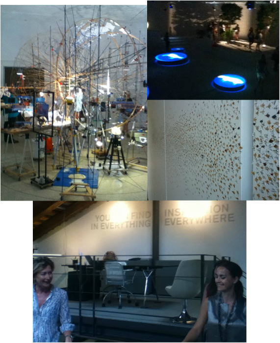
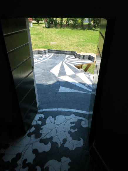
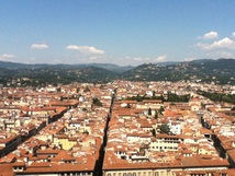 "During Italy" At the bottom I start to resolve your mystery The Colloseum, my first big discovery As I move upward I can tell Your beauty seems to swell That of your ration, structure, and iridescence Where the definition of art starts to make scence Headed to the top No, I'm not completely ready to stop. 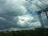 We move up t Florence! First Train ride! " The Duomo", the Bell Tower, the Baptistry. I enjoy the fact that every thing is so spacy and spread out here. Every thing appears to be larger in scale. I climb the dome. man what a challenge but it was defiantly worth it, great photo ops of the city... I climb the bell tower as well just as much of a challenge as the dome. loud bells and another great opportunity for photos. Seeing the city from both sides was amazing getting a close up of the colorful clouds, sun, and an amazing view of the city was indescribable. 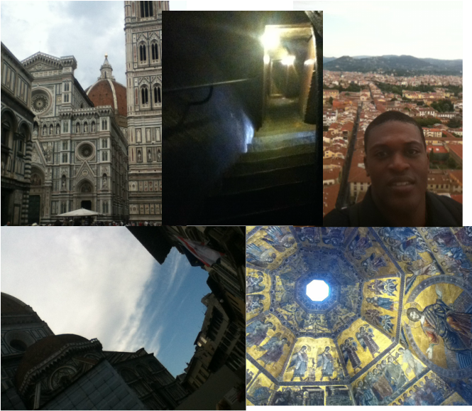
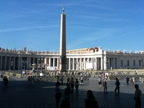 St. Peter's Basilica, Sistine Chapel, the Vatican Museum, Borghese park, Trevi Fountain, and Spanish Steps.<SUM> Wow! The many colors, beautiful/GOLDEN. The shadows, emphasis! The scale and structures of all of the painting and sculpture, amazing... every line and direction implied to create motion and action was very effective. so glad I got to see all of this. 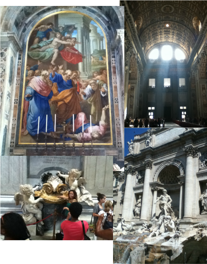 well we finally made it to Rome Italy and how excited I am to be here, there is a lot to see with so many photo ops. My first visual of the Colloseum was amazing. To see the scale and structure of it was simply mind blowing. I just had to put my self in front of it. ... and the spaghetti WOOOWWW! FRESH! 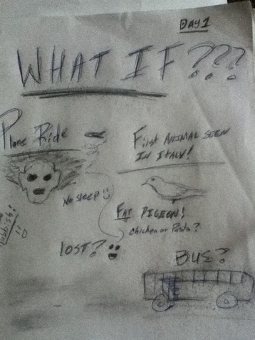 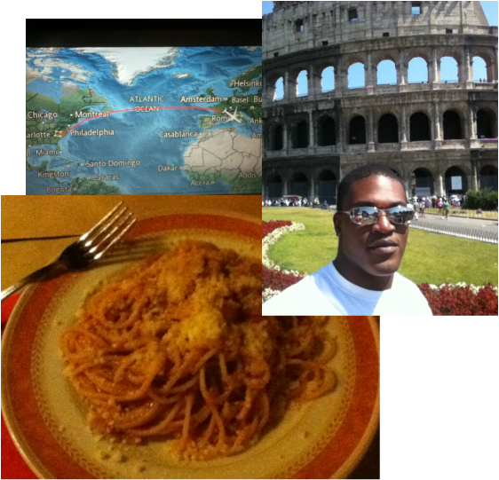
 "Before Italy"
I wonder if Your mystery Is all that it is said to be. Your color, your beauty, your romance I shall see. The waters that shape your boot, The difference in taste and food Are you the place where true art is revealed, The elements of principles and design fulfilled? This is the place I will see, To come discover and to critique. - Octavis Watkins
|
 RSS Feed