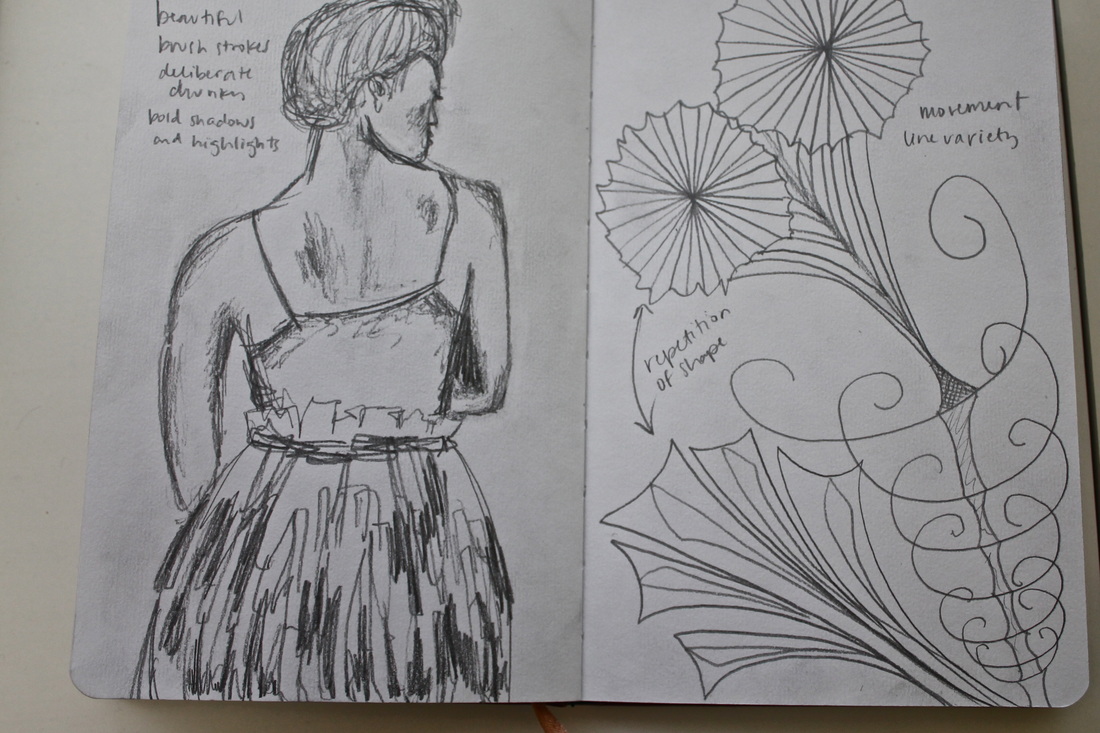
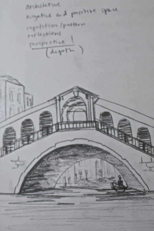
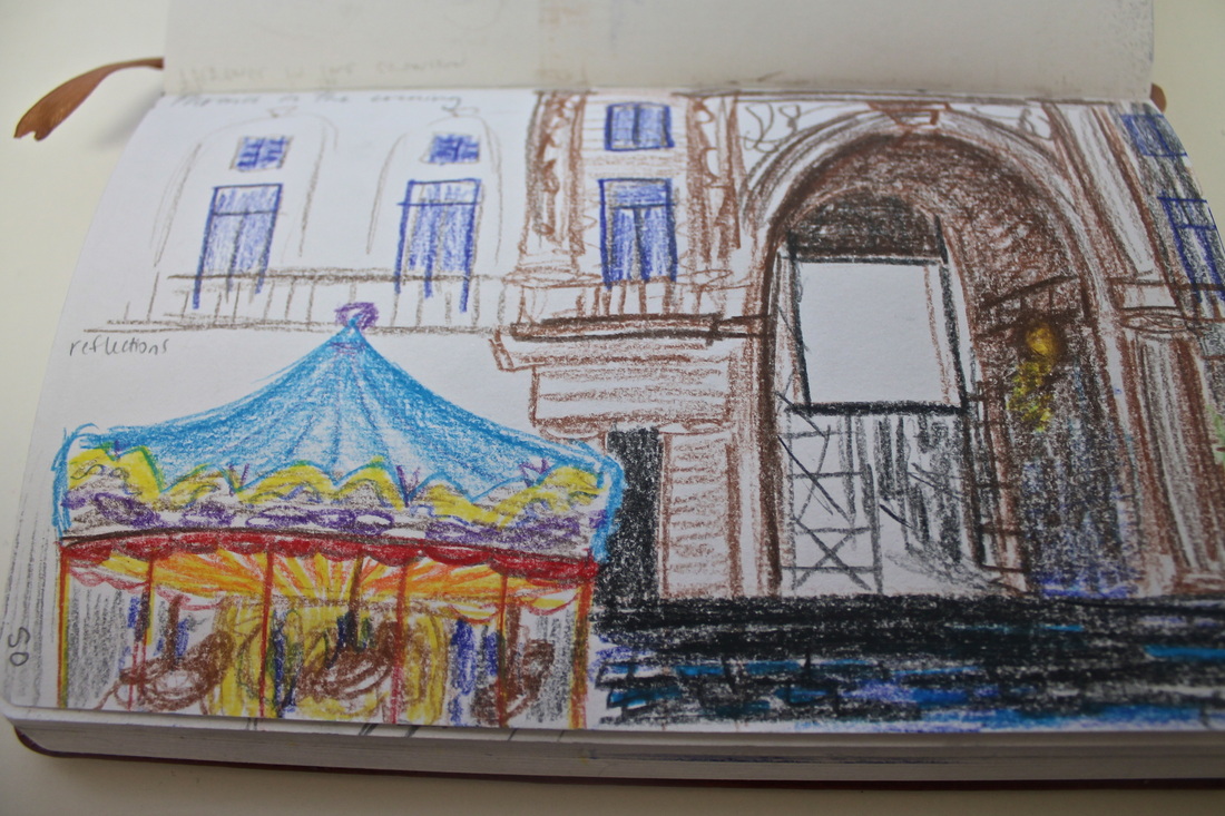
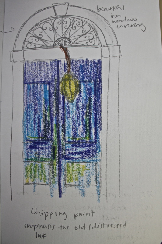
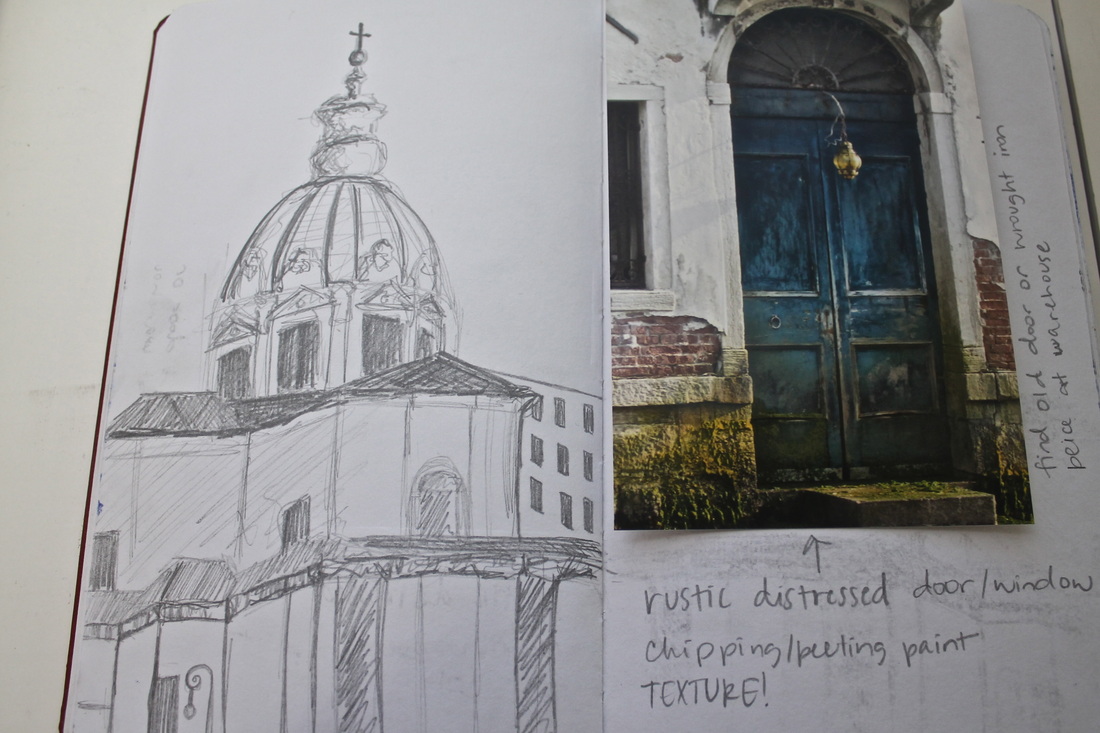
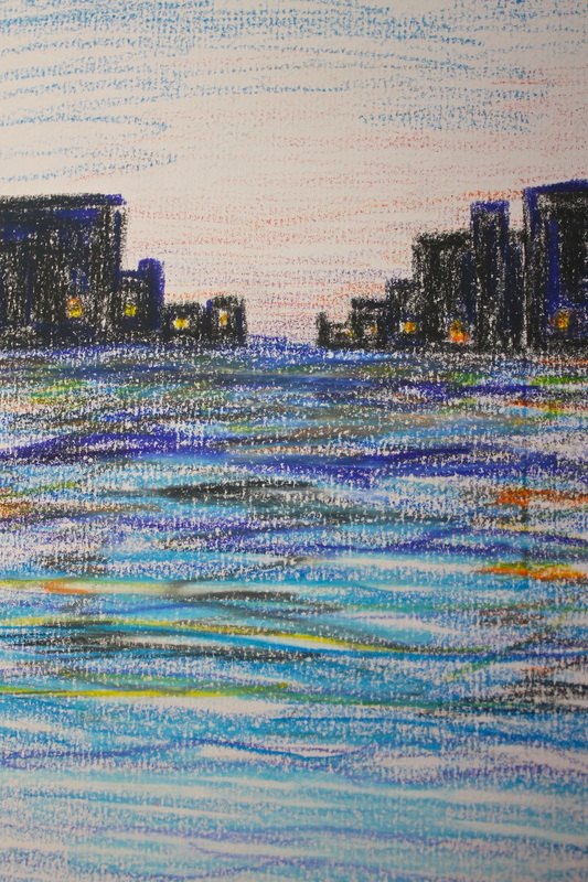
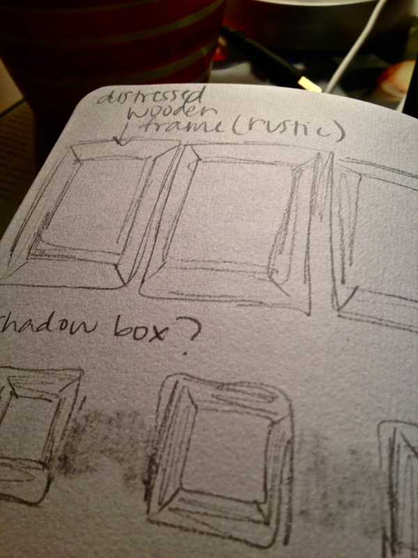
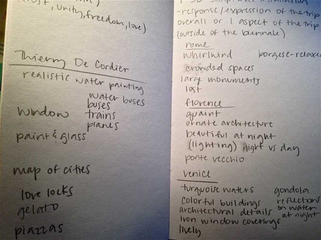
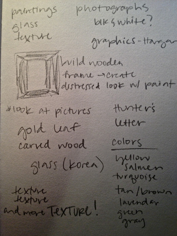
It is difficult to not be inspired by anything in a city like Venice, HOWEVER, that also makes it extremely difficult to narrow down the inspiration list to create a unified piece of art. My method of listing inspiring things resulted in pages covered front to back with random words, ideas and sketches. I tried thinking of just a few key words to describe my experience in Italy, in order to help myself narrow down my concept. The first thought was "whirlwind" or "overwhelming"...but in a good way of course. My next thought was the word "exposure", which got me to thinking about how I could utilize the many photographs I took. Double exposure. Those words right there can describe my experience and how I would like to portray my experience in Venice. These are just a couple of the designs I came up with while experimenting... 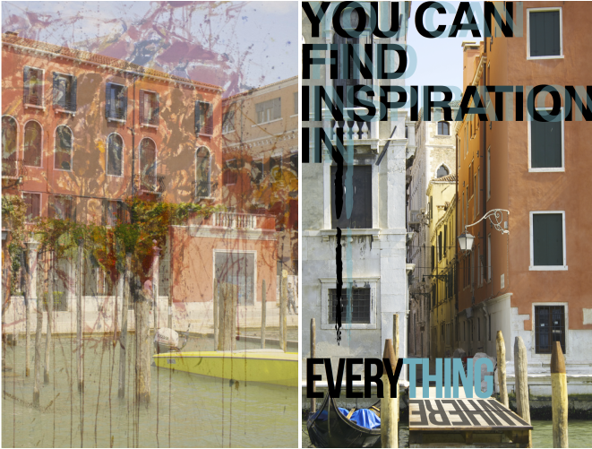 Among my list of inspiring things in Venice were: distressed woods (found in shutters, doors, stakes), mosaic glass, bold typography (found at Hangar Design Group) and OBVIOUSLY the bright and beautiful colors found everywhere in the city. 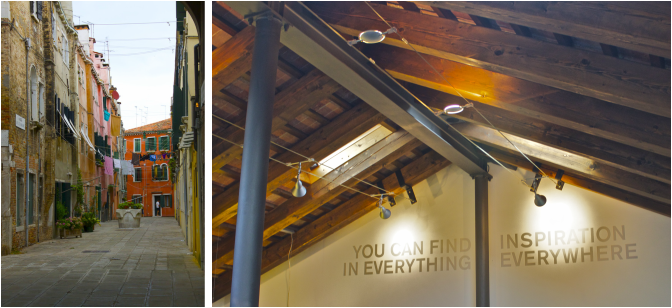 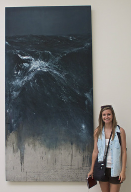 For my 2-D response piece, I would like to create a series of either double exposure photographs with bold graphics or paintings of the my photographs taken in Venice. I am extremely indecisive so I am almost always brainstorming or changing my mind. Either way, I will have some sort of mixed media to represent the overwhelming amount of art I was exposed to in Venice. I will have at least 3 pieces of artwork framed for this series. I want to incorporate the rustic, distressed woods I saw in Venice by creating handmade wood frames, that have hints of color as if they were worn down by the ocean air and maybe even some carved out details. If I end up creating a series of paintings, I would like to pull in the photorealistic techniques of Thierry De Cordier from the Biennale. His use of shadows and highlights in the water are what really captured my attention and inspired me. The reflections and highlights I noticed in my night photographs of the Grand Canal evoke a serene yet lively feeling, which I could portray by painting these pictures. The depth Cordier created completely absorbed me in his painting "Mer Du Nord". I also like the idea of combing typography with paintings, which is another type of media he chose to incorporate. I was also very inspired by the detailed wood carvings and distressed look that artist, Danh Vo, created with the wood as a part of his installation. Turquoise seemed to be a dominant color in Venice, whether it was the turquoise waters of the Grande Canal or the doors and shutters of the rustic buildings. This is the look I would like to recreate with my hand built frames. 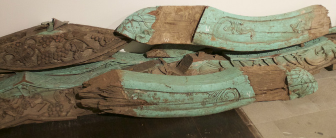 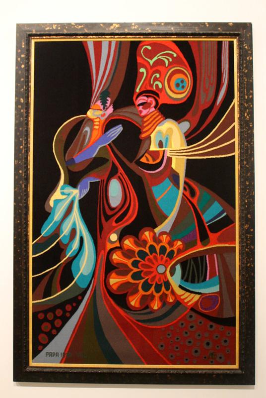
1935 Tivavouane, Senegal by Papa Ibra Tall The vivid color of this framed tapestry is what caught my attention when I saw it, and the overwhelming rhythm of this peice is what kept my attention. The bold color scheme works beautifully together and creates just the right amount of emphasis on the subjects of the composition. The fluid lines create movement as well as unique shapes. This tapestry contrast beautifully against the stark white wall of the exhibit. The tapestry was created in opposition to the colonial rule of African nations. Tall chose to abandoned the European art aesthetic he had studied in order to focus on the bold patterns and vibrant colors. This peice represents his artistic development as an individual, as well as the influences from his Senegalese roots. 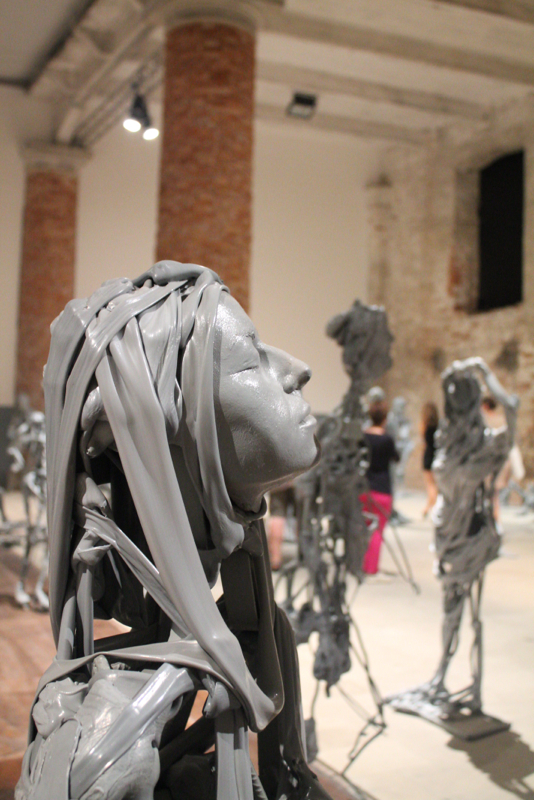
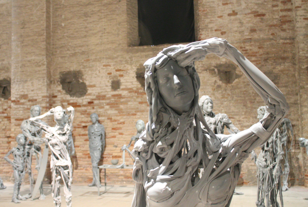
Venetians (2013) by Pawel Althamer It is impossible to walk by this set of 90 figurative sculptures and not want to get a closer look. Initially, I found the plastic sculptures to be slightly creepy when I saw just how realistic the human faces looked, but as we passed by them a second time around, I was fascinated by them. Althamer is a polish sculptor who utilized his father's plastic firm and the mold of his fellow collaborator's faces in order to create a jaw dropping set up of deteriorating bodies. The individual plastic muscles activate all of kinds of negative and positive space, while they also create movement around the bodies with their fluid lines. The texture of the faces that is replicated from the mold is just astounding. Every eyebrow and eyelash seemed so real that I was just waiting for one of the faces to just open it's eyes. The deteriorating bodies evoked feelings of abandonment and yet they seemed at peace. I felt as if they were the ruins of people that had been stripped down. 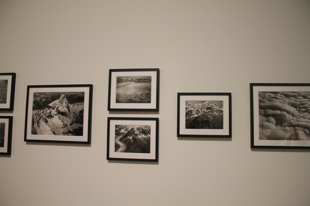
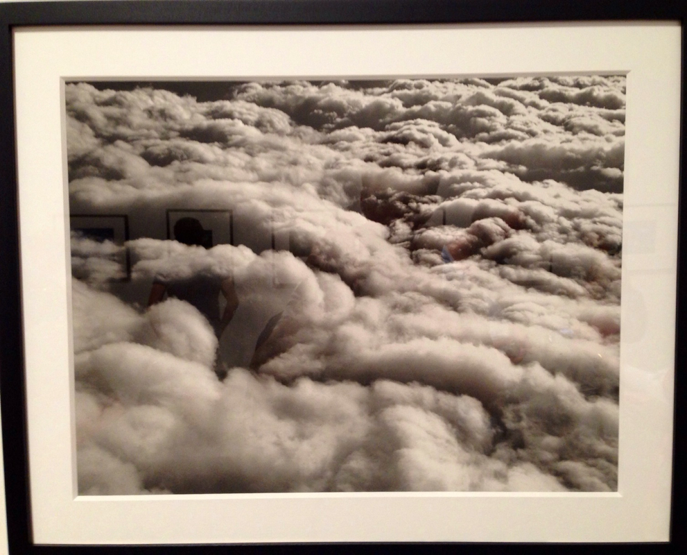
Ober den Wolken (Above the Clouds) by Eduard Spelterini Spelterini is a world renowned balloonist and was the first person to cross the Alps by air in 1889. This photograph was one taken by him when he decided to practice aerial photography just as Nadar did. Spelterini used a camera weighing over 88 pounds to produce black and white glass negatives that were later processed with color. The black and white filter is what gives the photograph so much definition and emphasis the dramatic highlights and shadows of the clouds. Beautiful shapes and patterns are created amongst the clouds which makes this spontaneous photograph that much more rewarding when taken. Seeing the aerial view of our world reminds just how amazing and huge it really is. The perspective the picture is taken makes it look like you could almost walk right across or on top of the clouds. The way the photograph is cropped leaves the actual proportions and size of the clouds completely up to the viewer's imagination. 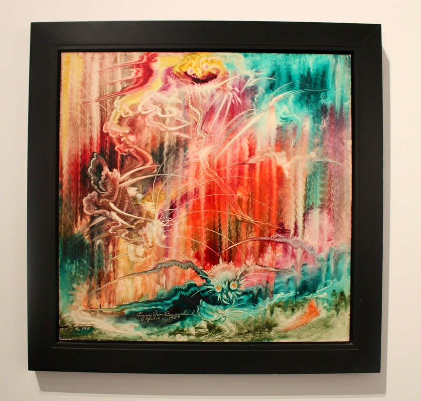
Untitled (No. 795) by Eugene Von Bruenchenhein This 24 x 24 inch, oil painted board is so incredibly vibrant and rhythmic. I was surprised to read that this was done with oil paint seeing as it has an overwhelming amount of fluid lines and movement. It seems to have that watercolor appearance with the almost dripping lines of color that fade on and out throughout the composition. I have always been drawn to bright and bold colors and this painting contains that to the highest degree. Movement and rhythm is created throughout the composition with vibrating lines and fading colors created as a result of Bruenchenhein's unique finger painting technique. His method was to paint wet-on-wet in a single sitting. There is an equal balance of warm and cool colors throughout, while lights and darks seem to be in perfect harmony. The abstraction of this painting leaves the subject matter completely up to the viewer's imagination. 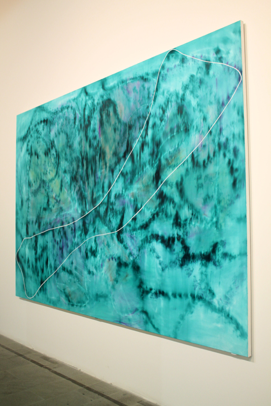
Untitled by Daniel Hesidence The luminosity of this painting really inspired me and caught my attention. The beautiful turquoise shades and highlights work together harmoniously to create a unified composition. Hesidence really plays around with light in this painting by creating what looks like reflections in the water. This abstraction contains fluid lines throughout that in turn create unique shapes and patterns.The white outlined shape set on top of the painting doesn't seem to disappear or become an emphasis; it's just a subtle contrast in the composition. My eyes move around the composition effortlessly and never feel overwhelmed by a rapid movement. The soothing blues and highlights of lavender evoke a peaceful state of mind and allow the viewer to reminisce and collect their thoughts. 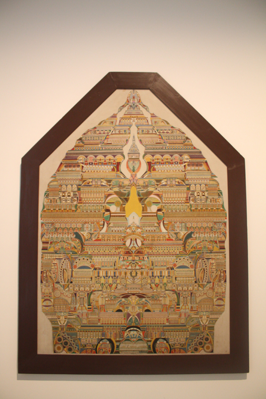
Symbolic Composition of the Spiritual World by Augustin Lesage This painting absolutely blew my mind when I first saw it. Not only is it a large scale painting but it is also extremely detailed AND symmetrical. Lesage painted this intricate abstraction with oil on canvas. The painting was a representation of his fascination with natural forms and Egyptian influence. The overall shape and color scheme of the painting is similar to the architectural shapes and warm colors found in the Middle East. The intricate composition seems to be representational of the many aspects of the spiritual world. Although there are many different religions and rituals they all are unified under the term of "religion" and "spiritual world". The symmetry and consistent color scheme of this painting is what creates that unity. 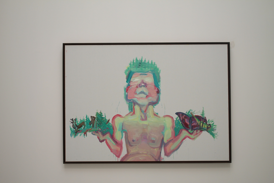
Mother Nature (1999) by Maria Lassnig This particular oil painting on canvas stood out to me because of its vibrant colors that seemed highly saturated in contrast with the stark white background of the canvas. The variety of line width and brush strokes creates a sense of movement that lead my eye around the composition. In exploring the content of this peice, I realized, not only from the title, that it was representational of a subject related to nature. The small trees and animals in contrast with the large human subject create a juxtaposition to the way we normally see nature as being much larger than an individual person. 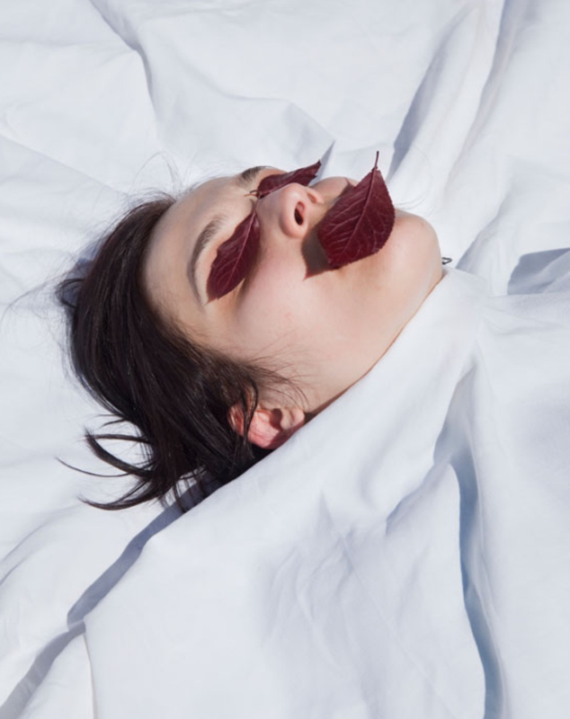
"unknown" photograph by Viviane Sassen All of the photographs Sassen presented at the biennale seemed to evoke a feeling of discomfort when I looked at them. She uses such bold colors and such a high contrast of shadows and highlights to create an absolutely striking photograph. This photograph in particular evokes a feeling of pain, fear or death, but when I separate the subjects of the photograph, it all seems very pure and innocent. There is a young girl, leaves, and white sheets, which all seems very harmless. However, it is the placement of the blood red leaves on the eyelids and mouth of the young girl that evokes such an overwhelming feeling of pain and discomfort for the viewer. 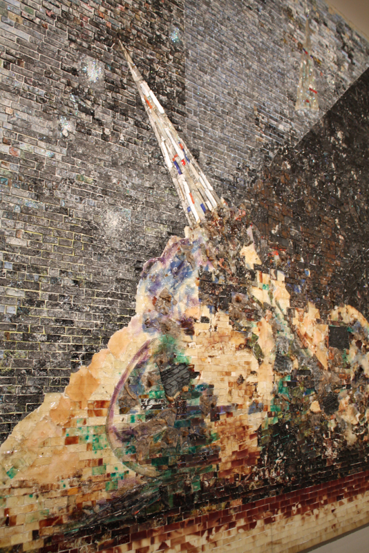
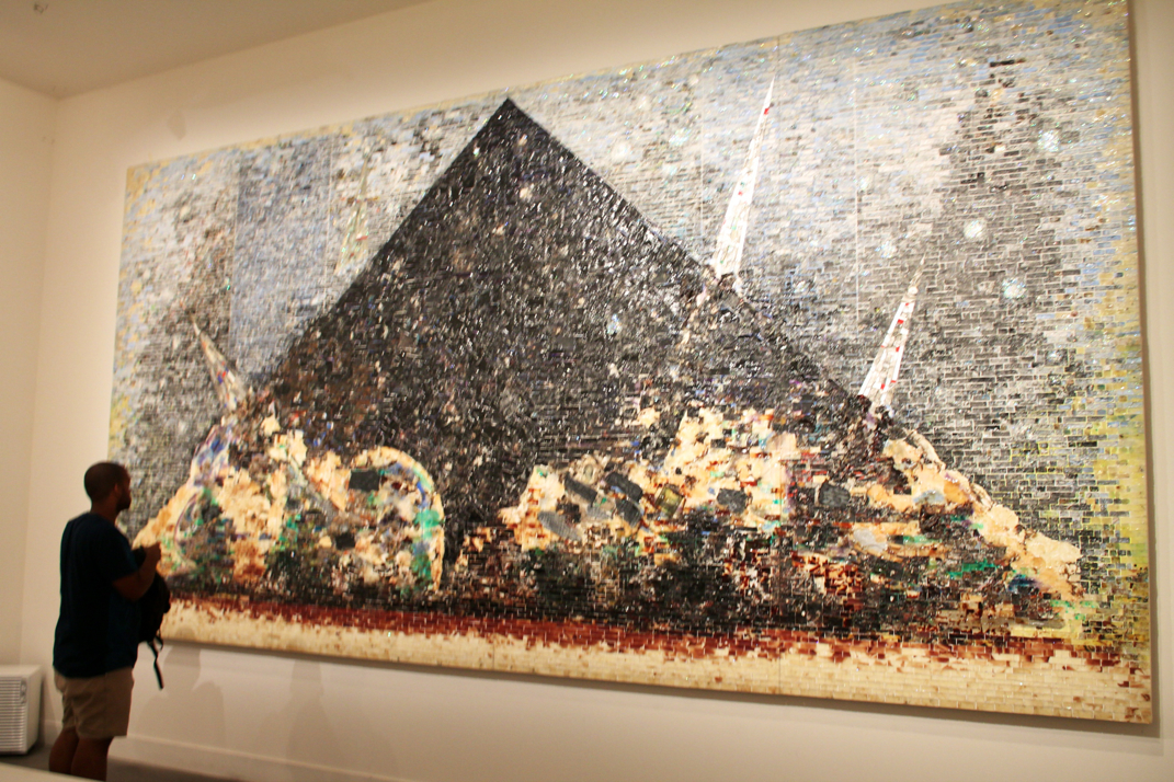
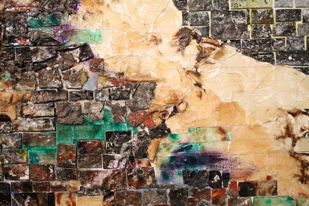
9-11-01 (2006) by Jack Whitten Whitten gives a whole new meaning to the technique of acrylic on canvas. This peice of art was created on response to the September 11 tragedy of 2001. This 10x20 foot size canvas is covered edge to edge with geometric peices of molded acrylic paint that serve as mosaic tiles in this enormous collage. This abstract "painting" represents the emotional heartache and disaster of that day in history. For me, there is a connection between the process in creating this art peice and the process of rebuilding our country after September 11th. Whitten used what could be "old", dried up acrylic paint to form a unified mosaic collage painting, while we, as a country, picked up the peices after the September 11th tragedy and formed a more unified nation. In essence, both the artist and his subject(s) seemed to put the peices back together. 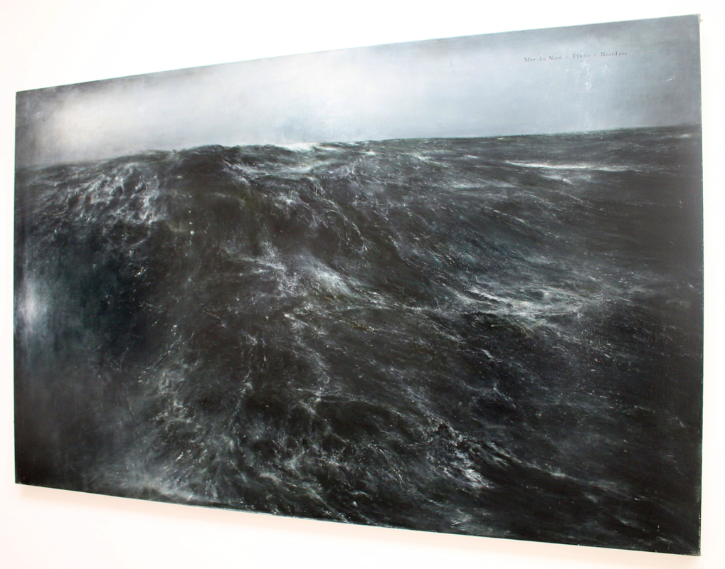
Mer Montee (2011) by Thierry De Cordier This painting along with the others in this series just blew my mind. The attention to detail, with every tiny crest of a wave or shadow of the water ripples, is just astounding. The painting was created with oil paint, enamel and Chinese ink and was used to create an extremely photorealistic painting. I was initially captivated by the dark and shadowy color scheme which made me want to look closer at the painting, where I found the realistic details of the foamy waters. The troubling shadows of the water evoked a sense of fear and mystery for me. July 10 I cannot believe it is the LAST DAY...there is still so much to do, so much to see!!! But no worries my friends, I will be back. Italy now has a special place in my heart and I will forever get the urge to be there and my thoughts will now be consumed with memories of this trip. My friends who studied abroad in Italy told me this would happen....they warned me. Anyone who has been to Italy, longs to be in Italy forever and ever. Ahh such a pity party I will throw for myself. Anywhoooo, for the last day in Venice it was all about the art! Anne and I got a little lost on our way to find the Arsenale Biennale site but ended up taking a few scenic routes around the streets of Venice. After having a little photo shoot in the streets, we finally found the Arsenale and saw some veryyy interesting works. Now....I don't want to sound like a hater...but there was a lot of artwork at the Arsenale that just seemed to be a nightmare. And by nightmare, I don't necessarily mean "bad"...I mean its scared me (and Anne). Despite some of the scary artwork, there were some very, very cool installations and paintings I came across. The paintings I photographed were just bursting with color, movement, rhythm and pattern. They all looked absolutely stunning against the stark white walls of the exhibit. 
After the Biennale, it was on to visit the Hangar Design Group in Venice!! This was a super exciting and nerdy excursion for all of the graphic design majors. After watching Professor Slagle sprint around the bus station to get our tickets and get us on the bus on time, we finally made it to our bus stop, where the bus driver told Slagle that we needed to walk down the road to find the Hangar Design Group building. Well folks, we walked all the way down the road, only to turn around and walk all the way back to the Hangar Building...right in front of our bus stop. Needless to say we got a little graphic design PT that afternoon. But it was a workout well worth it! The Hangar Design Group kindly provided us with water and air conditioning as we walked in the door and gave us a fantastic inside look at their firm. It was AMAZING to see just how broad their design market is. They showed us all kinds of designs from wine bottle logos to interior design to commercial design and beyond! It was so inspirational to see such kind and talented people. Before we left, they gave all of us a packet of three Hangar Design Group sketchbooks and Professor Slagle received what they called their "bible". Overall, it was a very welcoming and inspiring experience! 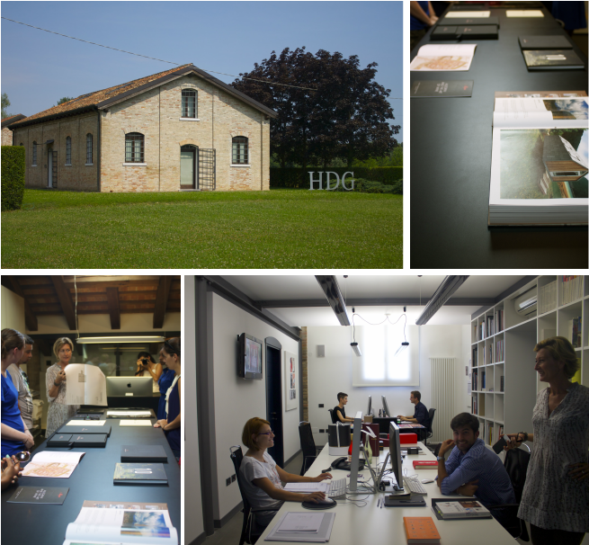
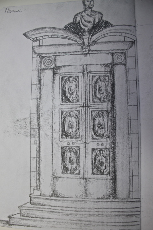
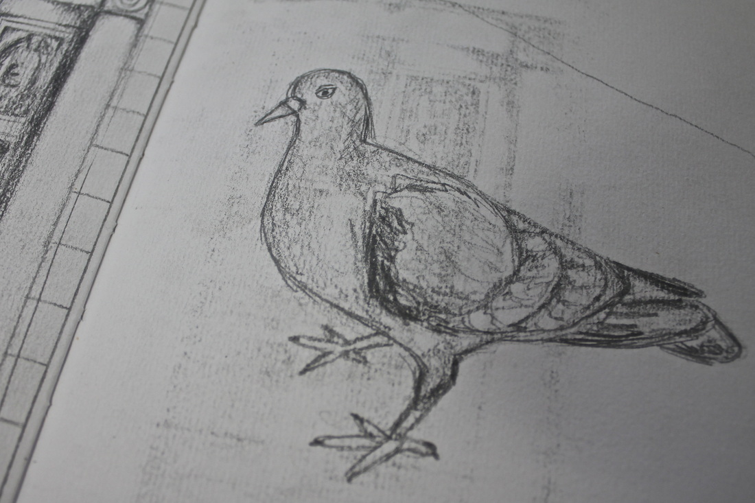
July 9 Woke up bright n' early to take a train ride to Padua, where we got to walk through the Scrovegni Chapel. Although we weren't allowed to stay in the chapel for very long, there was a lot to be taken in. The chapel was covered from wall to wall and even to ceiling with frescos painted by Giotto so long ago. If you didn't look around the every minute you were in there, you probably missed something. I swear every time I turned around, I would notice a person or a scene that I hadn't even noticed the first time I looked! Every now and then on this trip, after seeing artwork like Giotto's, I get hit with the thought of mind-blowing it is that these paintings and sculptures have last this long!! I'm mean...it's crazy to think about. And these aren't just any paintings or sculptures or structures...they are all extremely ornate and detailed. The artwork in this chapel has been seen by so many generations of people and had an effect on all of them. The effectiveness of these paintings is a result of the great craftsmanship and diligence. Time well spent is time well earned. 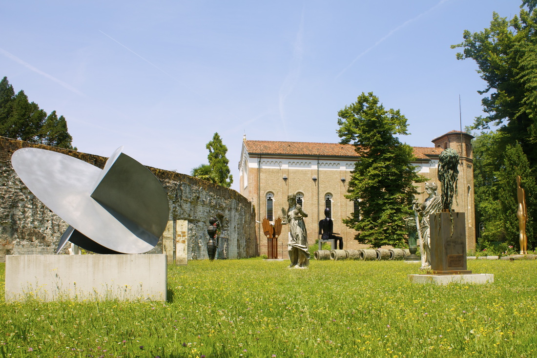 After roaming around Venice some more, it was time for a gondola ride! You just CANNOT go to Venice without having taken a gondola ride. So we got a group and set out for a gondola ride at sunset. The weather was beautiful and the waters were calm. I will say that I was a little uneasy to get into the gondola before everybody balanced out the boat. After though, it was smooooth sailing :) It was a wonderful evening with some wonderful people. The Crew & The View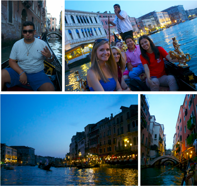 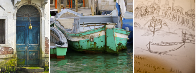 July 8 Today we went to the Accademia where we were able to put away the cameras and sketch the artwork we were seeing. This gallery contained many, many large scale paintings that all seemed to have similar content but were executed in completely different ways. Some of the paintings seemed to be soft and light, while other's had a hard edge and more attention to detail and definition. I began to look at the hands of people in each individual painting because some of them appeared so realistic, with veins and knuckles, while others were merely a soft outline of a hand painted a skin tone color. I preferred the paintings that chose to have a hard edge and more brush detail because I find myself more inspired by the photo-realistic paintings. Then it was off to the Guggenheim! This museum was filled with colorful, abstract paintings that inspired. I have always been drawn to bright colors and most recently found a new love for abstract paintings, after the abstract landscape assignment we had in Painting I. BE BOLD! I've learned that fearlessness is just one of the many techniques to creating a bold abstract painting. I paid close attention to the brush handling in each of the paintings I saw in the Guggenheim Museum. One brush stroke or one pop of color can completely change the way a painting is perceived. 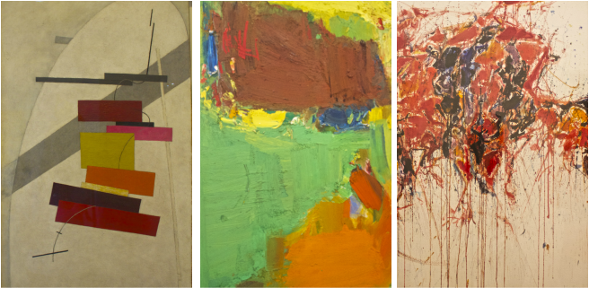 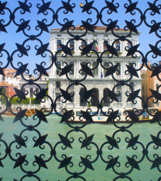 Color and texture inspiration was not only in the galleries and museums we went through; I found inspiration from the colors and textures on the doors, window coverings, buildings, wood, etc. all throughout Venice. I tried to take tons of pictures on the water bus rides just to make sure that I did not miss out on anything that might inspire me for my reflection pieces. For my response pieces, I definitely want to find a way to incorporate the distress wood and turquoise color I saw on the doors and windows. I also want to weld something similar to the window coverings I noticed throughout Venice (the picture below is of a window covering that was at the Guggenheim Museum. Almost forgot to mention that a big group of us went to Lido Beach in Venice at the end of the day! Seriously, HAD THE TIME OF MY LIFE. So much fun. There was singing and dancing and photos being taken continuously. I loved getting to bond with everyone and just having a fantastic time! And the view from the water bus on the way back to our hotel was just a view I will never forget. BEAUTIFUL. 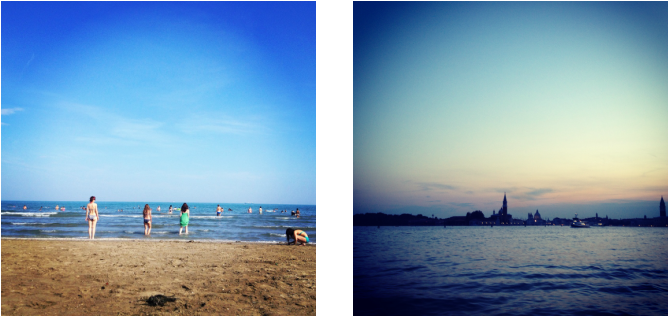 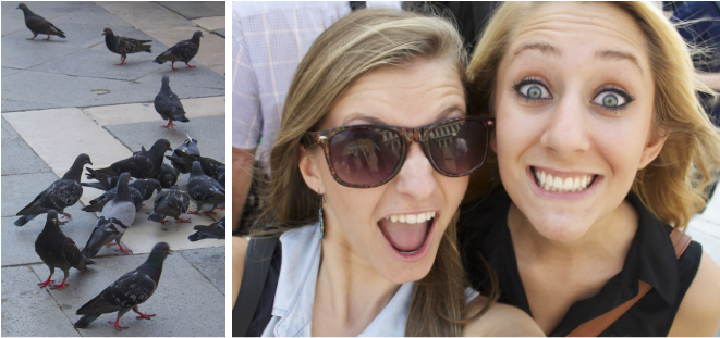 July 7 After gathering in the Piazza San Marco and having a photo shoot with the pigeons, we headed off to the Biennale to see some amazing (SERIOUSLY AMAZING) art pieces. The paintings were absolutely beautiful and were all so different. One particular series of paintings that literally made my mouth drop were by a Belgium painter by the name of Thierry De Cordier. The large scale images of dark, troubling ocean water immediately captured my attention when I entered the room and then when I realized that they were paintings and not photographs, I was absolutely astounded. I have always been inspired by photo-realistic painters and was especially inspired by the detailed brush strokes of Cordier's work. These paintings completely absorb the viewer with their shadowy, dark palette. 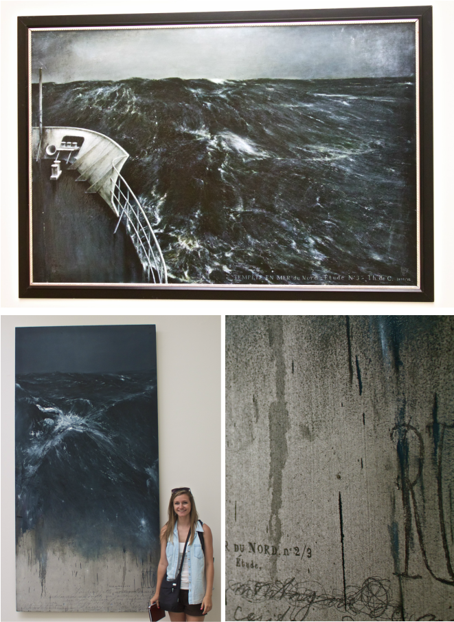 The Giardini National Pavillions. SO MUCH FUN. Going through all of the different countries was like an art amusement park. Some of the countries' "rides" made me a little frightened....like Korea for example, when they stuck Sean and I in a silent, pitch dark room for about 5 minutes with two other people. Very interesting...but the mirror building they created was so cool! The reflections just seemed endless and I have never been so happy with my decision to not wear a skirt or dress that day...could have been an awkward situation. Overall favorite countries were definitely France, Russia and Venezuela. Oh and America OF COURSE. France had an amazing installation made up of interconnected wooden stools that just blew my mind, while Russia had an installation that was raining gold coins, where only women were allowed to be at the bottom of the falling coins with umbrellas (and got a free coin for a souvenir!). Aside, from the excitement of falling money, it had an interesting message about the role gender plays in greed and wealth. Then last, but certainly not least, Anne, Sean, Team Slagle and I stopped in Venezuela to see the brilliant, graffiti light display they had going on inside the dark room. I could have watched the lights and colors play on the graffiti painting all day. Super cool. 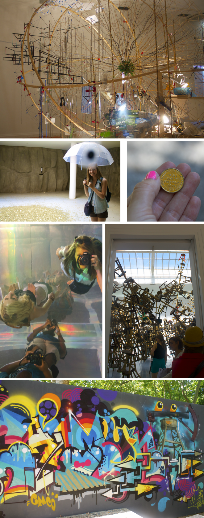 July 6 Sleeeeeep. Anne and I had a leisurely morning after we caught up on some MUCH NEEDED sleep and then settled in at a restaurant downstairs by the hotel for a little bruschetta brunch. All packed up and ready for Venice, we headed back to the train station to embark on our next Italy adventure. On the train ride, Anne and I sat next to the kindest mother and daughter from New Zealand. I could just listen to their accent all day long!! But to top it off, they were just so nice and friendly. The scenery from the train window was just beautiful. I love getting to see the countryside and vineyards of Italy. And at last, both our group and our New Zealand friends managed to get off at the wrong stop at the train station soooo shortly after we all realized our mistake, we got right back on another train and FINALLY made it to the beautiful Venezia!! For me, just the air felt totally different in Venice. It was refreshing to see all the colorful buildings and turquoise canals. I had a hard time telling whether our little bed and breakfast hotel was charming or creepy....the lobby was freakin' adorable. I loved the beams and fresh flowers that appeared everywhere in the hotel. HOWEVER, once Anne and I dragged our luggage up to what felt like the top of Mt. Everest, we discovered our converted attic bedroom haha. I found it to be pretty humorous and cute at first, but then as the night arrived and I laid awaken by the creeks and shifts, it wasn't so cute anymore. Now ask me about Bennell and Mia's room right next door...??? PRINCESS SUITE. Ridiculous. They had not one, but TWO sitting areas and enough room to have a small party in there. Needless to say, Anne and I had company over frequently in our room and it became far more comforting. Charming Bed and Breakfast...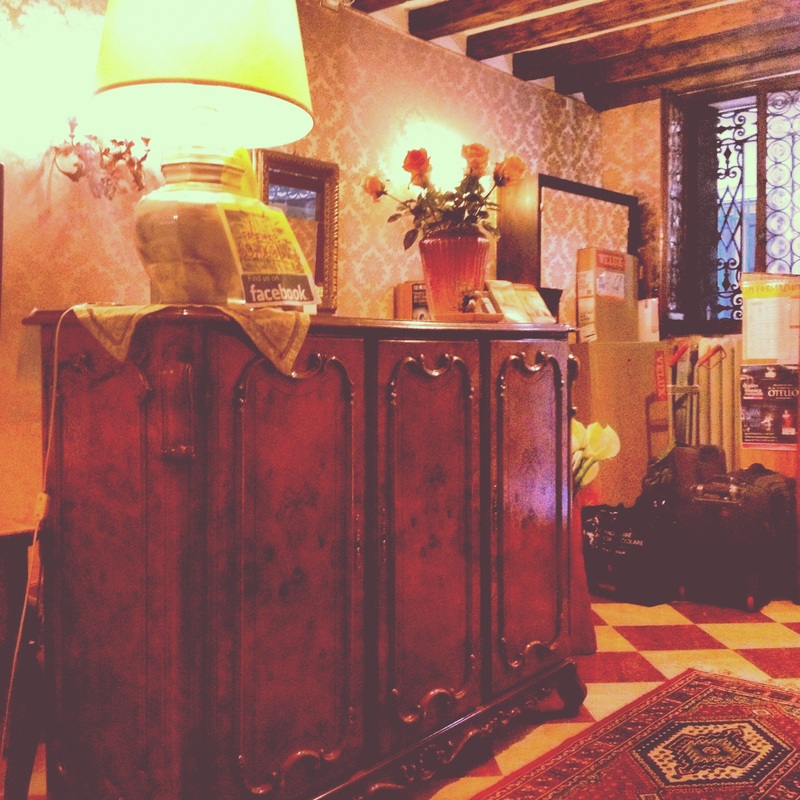 Not so charming Cinderella attic...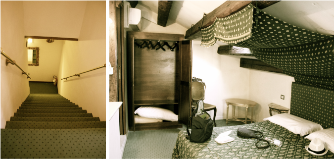 After settling in, Ashanta, Anne, Emily and I set off to find a delicious place for dinner! And WE SUCCEEDED. We ended up finding a unique Jazz Bar/Restaurant not too far from our hotel that had both seafood and pasta. There were bras hanging all over the ceiling, so naturally, we asked our waiter if you got something for free for hanging your bra from the ceiling, to which she responded that it was just a tradition... I ordered the Linguini with Prawns and Rocket Salad and it certainly satisfied. Delicious. And then to top the dinner off, we got free shots of Limoncello...they know how to get a good tip in Venice ;) 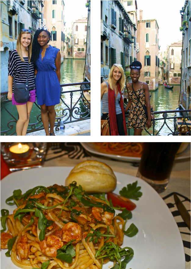 July 5 Florence was so nice to Anne and I. After having somewhat of a rough time in Rome, Anne and I were able to make wonderful Italy memories in Florence. Seeing David first thing in the morning was definitely an awesome way to start the day. It was also awesome not having to trek all the way across town like we did in Rome. Florence was SO MUCH more quaint and comfortable. 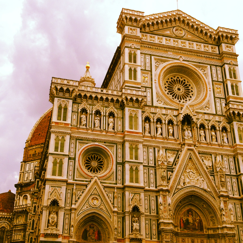 After sketching David and seeing all of the artwork, it was onto the markets!! Shopping was DIVINE. We bartered and bought and bartered some more. The key for shopping in the markets is to ONLY have the price you would like to pay in your wallet. For example, "I would love to pay the $65 your asking for BUT I only have $34 in my wallet..." And normally, that will seal the deal and you will snag a GREAT deal. The Uffizi Gallery was so enormous and filled with beautiful peices of artwork. One painting that Anne and I made commentary on was the "The Birth of Venus". In art history, Pitts was constantly saying how you had to see these paintings in person but when we saw the "The Birth of Venus", it was at less saturated than we both expected. Still a beautiful painting but completely different from the image we had seen. And once again, I just stared in wonder and the BEAUTIFUL CEILINGS. Covered in gold leaf and stunning artwork, it is hard to not be distracted by them the entire time you're walking. 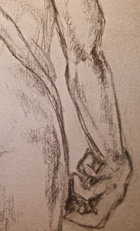 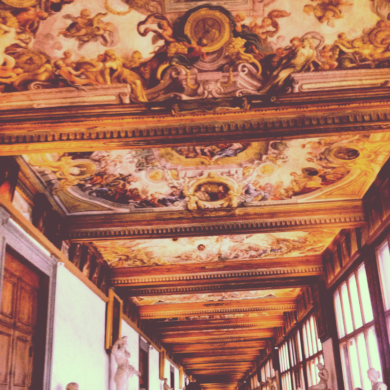 And then to end our day on the most perfect way, Anne and I had a fantastic dinner on a porch restaurant that looked over the Arno River at sunset with a view of the Ponte Vecchio. I had salmon with a pepper sauce that was absolutely WONDERFUL. Seriously...I could drink that sauce by itself, it was so delicious. And then to top it off, we stood on the Ponte Vecchio and snapped pictures of the beautiful sunset while eating gelato and listening to this wonderful Italian man play guitar and sing Coldplay songs. It was quite possibly the best and most unreal moment of my life. I wished I could stay there forever. AND THEN, just to make a perfect evening EVEN more perfect...I found the letter my friend Hunter had left for me under bench By the baptistery while she was studying in Florence the previous week. SO WONDERFUL. 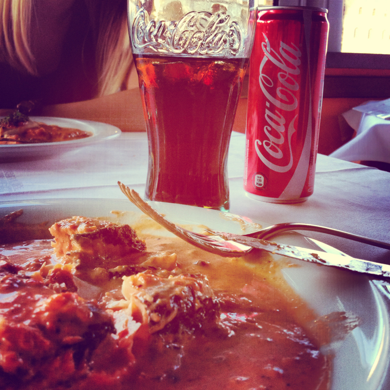 |
 RSS Feed