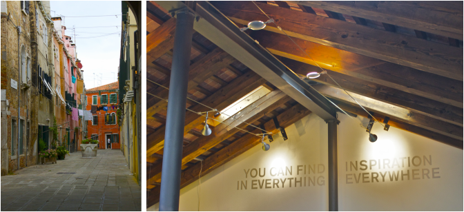
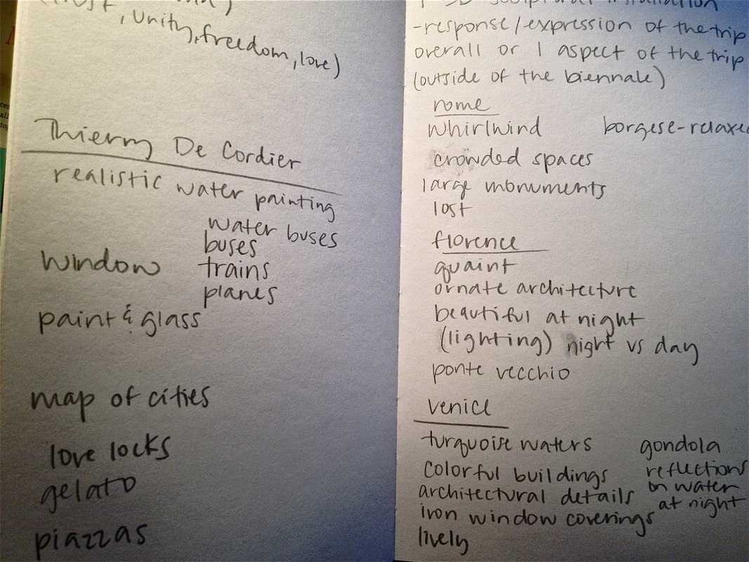
It is difficult to not be inspired by anything in a city like Venice, HOWEVER, that also makes it extremely difficult to narrow down the inspiration list to create a unified piece of art. My method of listing inspiring things resulted in pages covered front to back with random words, ideas and sketches. I tried thinking of just a few key words to describe my experience in Italy, in order to help myself narrow down my concept. The first thought was "whirlwind" or "overwhelming"...but in a good way of course. My next thought was the word "exposure", which got me to thinking about how I could utilize the many photographs I took. Double exposure. Those words right there can describe my experience and how I would like to portray my experience in Venice. These are just a couple of the designs I came up with while experimenting...
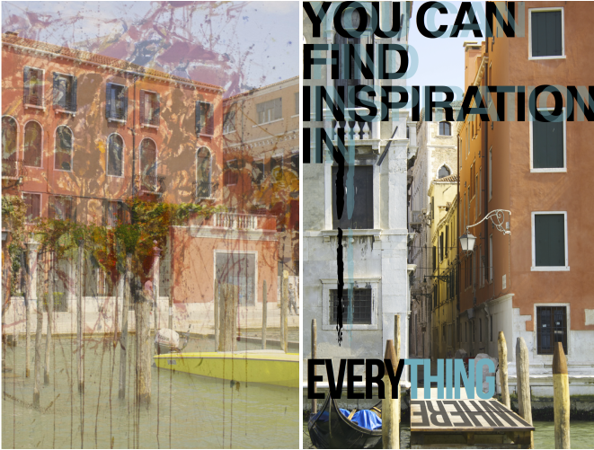
Among my list of inspiring things in Venice were: distressed woods (found in shutters, doors, stakes), mosaic glass, bold typography (found at Hangar Design Group) and OBVIOUSLY the bright and beautiful colors found everywhere in the city.
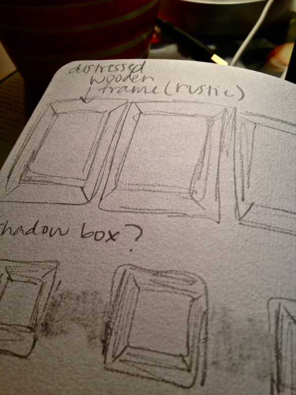
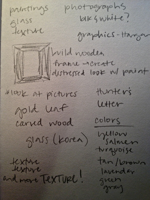
For my 2-D response piece, I would like to create a series of either double exposure photographs with bold graphics or paintings of the my photographs taken in Venice. I am extremely indecisive so I am almost always brainstorming or changing my mind. Either way, I will have some sort of mixed media to represent the overwhelming amount of art I was exposed to in Venice. I will have at least 3 pieces of artwork framed for this series. I want to incorporate the rustic, distressed woods I saw in Venice by creating handmade wood frames, that have hints of color as if they were worn down by the ocean air and maybe even some carved out details.
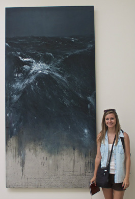
If I end up creating a series of paintings, I would like to pull in the photorealistic techniques of Thierry De Cordier from the Biennale. His use of shadows and highlights in the water are what really captured my attention and inspired me. The reflections and highlights I noticed in my night photographs of the Grand Canal evoke a serene yet lively feeling, which I could portray by painting these pictures. The depth Cordier created completely absorbed me in his painting "Mer Du Nord". I also like the idea of combing typography with paintings, which is another type of media he chose to incorporate.
If I end up creating a series of paintings, I would like to pull in the photorealistic techniques of Thierry De Cordier from the Biennale. His use of shadows and highlights in the water are what really captured my attention and inspired me. The reflections and highlights I noticed in my night photographs of the Grand Canal evoke a serene yet lively feeling, which I could portray by painting these pictures. The depth Cordier created completely absorbed me in his painting "Mer Du Nord". I also like the idea of combing typography with paintings, which is another type of media he chose to incorporate.
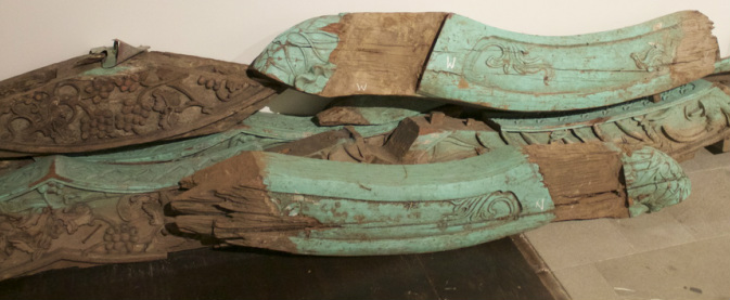
I was also very inspired by the detailed wood carvings and distressed look that artist, Danh Vo, created with the wood as a part of his installation. Turquoise seemed to be a dominant color in Venice, whether it was the turquoise waters of the Grande Canal or the doors and shutters of the rustic buildings. This is the look I would like to recreate with my hand built frames.
 RSS Feed