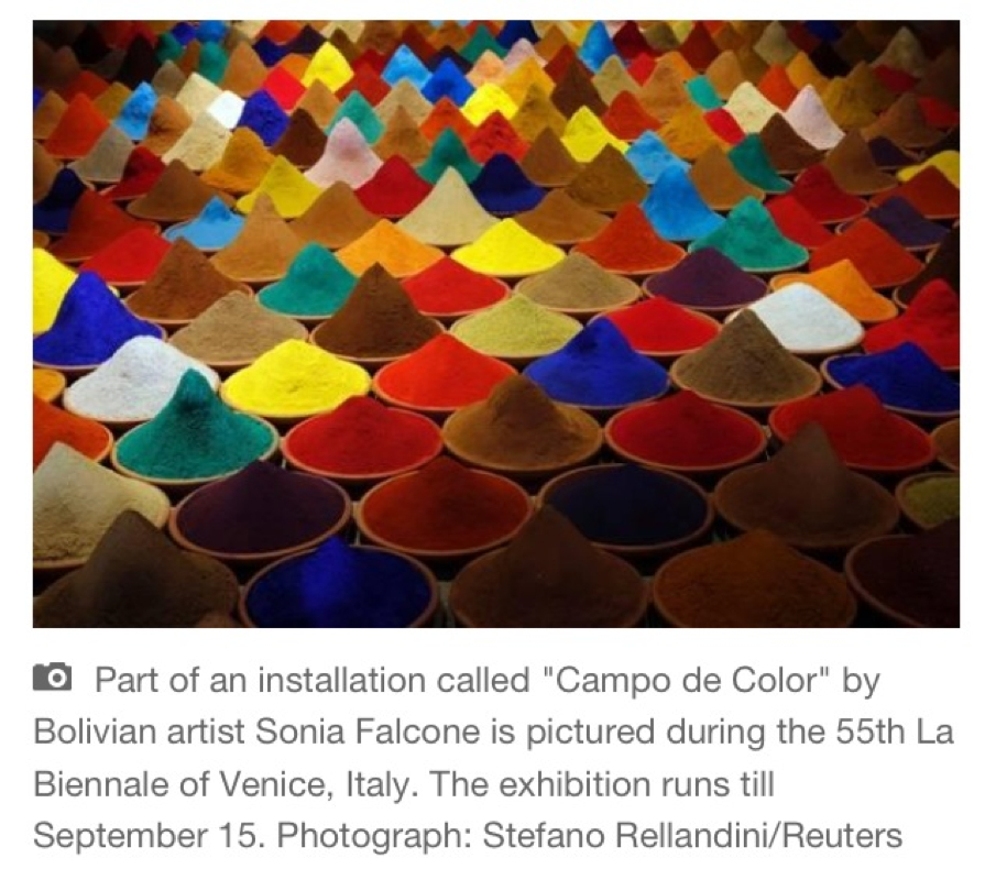
While searching hashtags on Instagram I found a photo of this gorgeous colorful exhibition. I can't wait to check it or for myself. It's called Campo de Color meaning Field of Color, by a Bolivian artist named Sonia Falcone and is created using various pigments and spices in ceramic jars. It is shown in the Latin American pavilion which is located in the Arsenale. "Throughout history, spices have motivated marine exploration and trading routes and here inspire the creation of a new landscape. Falcone covered the floor with hundreds of clay pots filled with cocoa, cayenne, chilli, achiote, pepper, cinnamon, turmeric, thyme, mustard, curry, paprika and more – a rich variety of spices to create a minimalist composition in the colour field style. Unlike the smooth, cold surfaces of North American minimalism, Falcone’s visual feast displays reliefs composed of pulverized flavours, as hot as Latin American chilli or as sweet as Oriental cinnamon. While the routes of the spices linked Asia to the ports of Venice in the Middle Ages, Campo de color completes the cartographic picture by drawing in the palette of flavours from the New World." -http://artsy.net/LatinAmericanPavilion
Katrín Sigurdardóttir
Description:
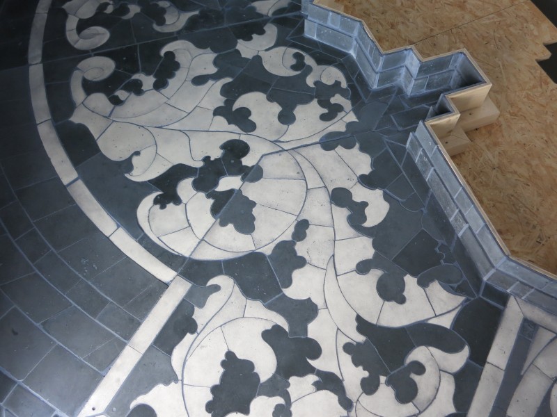
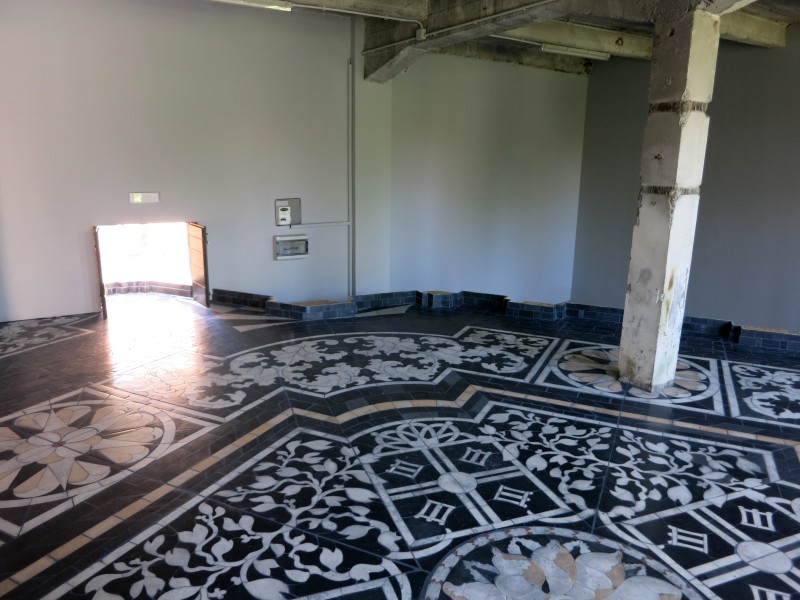
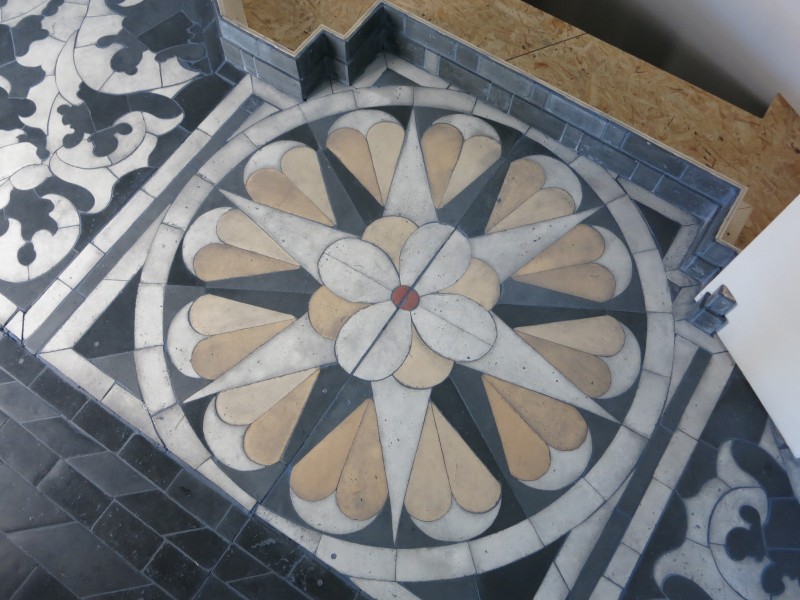
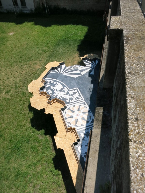
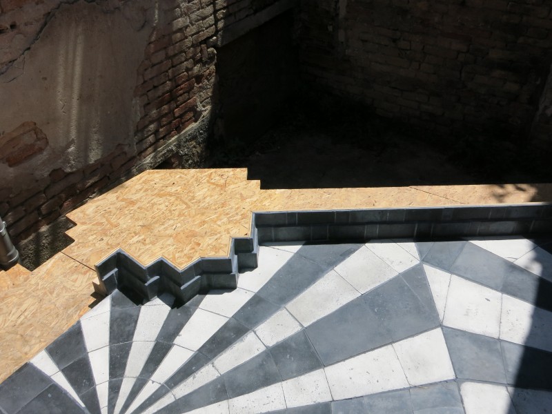
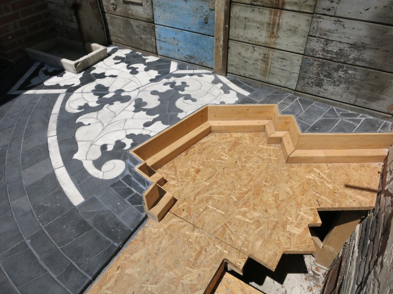
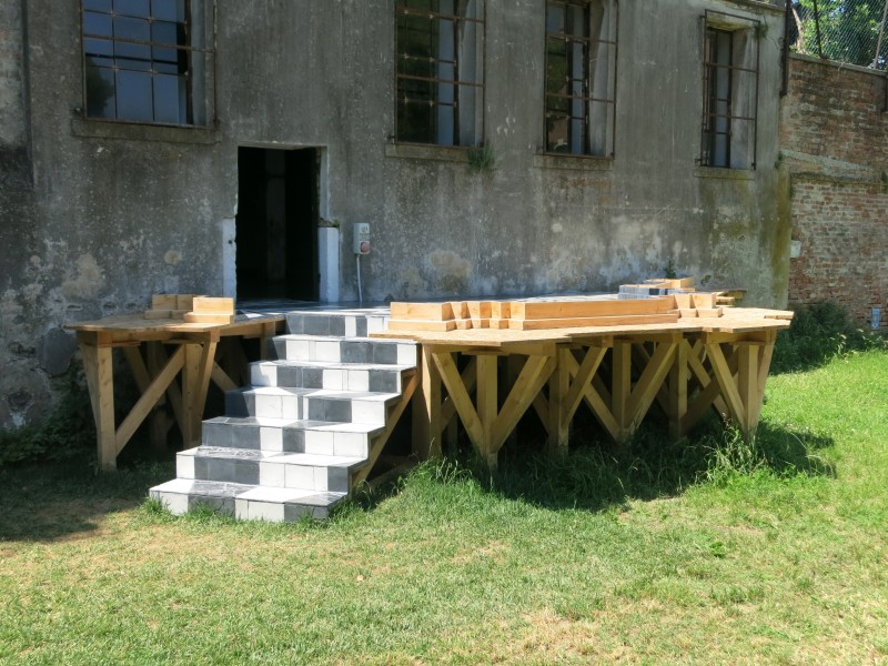
Sculptural installation: Foundation for the Lavanderia-The Old Laundry at Palazzo Zenobio
Size: intersects both inside and outside of an auxiliary building 18th Century Pavillion - approximately 90 sq. meters.
Analysis:
This work is in a baroque style, which uses strong leading lines and exaggerated detail to produce feelings of grandeur. The size of the piece itself spans almost 970 sq feet.
This work is also representational of the floor plan of a traditional pavilion, utilizing negative space around the wall where pillars would have been. The piece has a monochromatic color scheme and is artisanal tile handmade by the artist and her team. The patterns in the floor have nice symmetry and repetition that echo throughout the whole piece. The artist thought about the entire experience of walking through the piece, even the view outside of the floor from above. The artist wanted to ensure that the viewer was able to "enter from different points, navigate in multiple ways, and view from several levels, so that the visitor is both in the work and at the same time able to observe herself in the work."
Overall the artists works is defined by lack of presence: rooms without people or color, and interiors pared down to anonymous essentials that exist as markers of the artist's specific memories. This is important to the artists aesthetic, although this is her first full scale architectural interpretation.
Interpretation:
The footprint of the sculpture is similar to an 18th century pavilion, which is an architectural building that was familiar to Sigurdardóttir, but this footprint has her own memories intertwined with them. "By superimposing an elevated, highly decorative surface onto the Lavanderia, Sigurdardóttir brings the two buildings, the pavilion and the laundry, together. The pavilion, symbolizing the opulence and leisure of the owner, is contrasted by the laundry’s associations with labor." Her control of the architectural elements has more to do with the the memory of those elements rather than the accuracy of them. "The project is born from a career-long exploration of distance and memory and their embodiments in architecture, urbanism, cartography, and landscape." Also because Iceland lacks its own pavilion in the Giardini, the sculpture becomes a metaphor for the outline of the national space, and its mark on the Biennale.
Judgement:
The thing that I find interesting is that after the Biennale is over, it is going to "Reykjavík Art Museum and then to the SculptureCenter in Long Island City, New York. Sigurdardóttir will adapt the sculpture to the new architecture of each location, yet it will maintain its original footprint as well as the cut-out memory of the walls of the previous sites." I find the fact that she will leave a ghost of each location at each place it is installed to be appealing, and I would love to travel to visit this exhibition in each of its other locations to experience it. I feel like this is a great example of how artwork can grow into something of its own. I can't wait to be able to experience it when we are in Venice.
Katrín Sigurdardóttir explains, “This work is about drawing. It’s about labor, and it’s about spatial immersion. I wanted to create a work that could be entered from different points, navigated in multiple ways, and viewed from several levels, so that the visitor is both in the work and at the same time able to observe herself in the work. This work is both new and familiar, familiar in that it will key into a twofold perception—to experience and concurrently observe oneself experiencing—a kind of existential trickery that I have played with in previous works. It is new in that it’s my first full-scale architectural interpretation.”
Continued: Prompt: Write 1-3 sentences about each of these artists: http://www.contemporaryartdaily.com/2013/06/venice-biennale-2013/16) Geta Bratescu Mixed Media The very first photo is very vibrant, and looking at all of the other pieces, has the same structure to its design. Each piece has the same familiar shapes, but used in a different way. I think the materials used are very interesting, as they appear to be sewn to the canvas. I think that all of the pieces are cohesive, and they all lead to the main focal point, which is the vibrant colorful piece. 17) Harun Farocki Video The beginning of the video shows people touching the wall of the Vietnam Veteran wall. The video is of people touching historic pieces in time, and the very end shows people on a 4-lane highway stopping to show respect on Rosh Hashanah. While the entirety of the video is 47 minutes long, I would have a hard time standing around to watch it. Perhaps the video plays on loop, and part of the viewing experience is which piece of the video you catch? 18) Helen Marten Sculpture There are many pieces in this artists exhibit, and I can’t tell which ones are physical parts of the exhibit or photographs. The use of the screen on the entirety of the wall opposite of the physical exhibit causes a directional shift for the viewer, which can direct the attention to the photos on the wall instead of the interesting sculptures built on the opposite wall or on the floor. To me all of the photos on the Contemporary Art Today website is very overloaded and I prefer economy. 19) Simon Denny Sculpture I think that these sculptures are very creative. The juxtaposition of the inside on the outside and the outside on the inside is interesting, and makes me want to view it closer. One view is all closed doors, and the opposite view is open and showing all of the wiring. But when you cross the middle, you see a very organized arrangement of TVs, or from the opposite side of that melted TVs. There is so much going on, but you have to view it in the round in order to appreciate it fully. The use of negative space in between the walls is creative, especially having a 3 dimensional photograph on a flat surface. 20) Lynette Yiadom-Boakye Painting The overall color scheme is very dark, with only small highlights to bring attention to the focal point. Economy of line is sort of overpowered by the darkness of the entire composition, but the two work together harmoniously to create a cohesive collection. 21) Jos de Gruyter and Harald Thys Video The monotonous voice in another language throws me off. It is as if the red head that is on the screen the majority of the time is telling stories. I did not really want to watch the whole thing because it does not keep my interest. 22) Pamela Rosenkranz Video/Mixed Media Watching the video I get the impression that I will be painting as part of the art. The video is an entire warning about protecting yourself from the chemicals in paint on repeat for an hour. It also mentions the dangers of smoking. The voice sounds mechanical and like a recording. The sounds would not really interest me in walking closer to the art on the wall because there is no connection. 23) Trisha Donnell Sculpture The sculptural block in the middle of the room has carvings on one side and not the other which could be commenting on the unfinished artwork of many artists. The space in the room is taken up by pieces that look to hold other sculptures. It reminds me of an art storage space. I believe that the artist is also making a commentary on all of the art that is in storage and is not being seen by the world. 24) Rudolf Stingel Painting/Monographs The entire space is covered from floor to ceiling with oriental rugs. I find this fascinating as it closes off the room and makes them appear smaller than they are. The designs on all of the surfaces are very symmetrical. The actual artwork on display is almost hidden within the busy designs. 25) Yüksel Arslan Painting/Drawing/Mixed Media Many of his designs use faces or elements of the body. There are many phallic elements as well. A few of the pieces look like a drawn collage, such as the man with a beard. The man’s beard is made up of naked people. The arrangement of the work is asymmetrical which is in line with the artists aesthetic. 26) Christopher Williams Photographs The majority of his work is in black and white. All of them are also plants except for one, which is an Elle magazine cover. While the majority of his collection is cohesive, the one outlier does not fit. 27) Katrín Sigurdardóttir Sculpture This baroque style sculpture is interesting in its design because the artist moves it around, yet keeps the footprint and cut out memory of all of the previous sites. In this case it has 2 staircases for visitor access but I believe that the most beautiful view is from above. The tile design has lines that lead you throughout the composition, and it looks to be a traditional baroque marble floor. 28) Lawrence Weiner Written Art The Grace of a Gesture is presented on the ground floor of the Piazza Bembo, and as an extension will be on the side of 10 vaporettos in 10 different languages. I think that it would be very interesting to see on the side of the vaporettos, which would make a huge gesture, and define what the title of the exhibition is. 29) Mathias Poledna Color Film Knowing the technique used to create this short film, allows the viewer to connect to the artwork. 5000 handmade sketches, layouts, animation drawings, watercolor backgrounds, and ink-rendered animation cells are only a small part of what was used to create the film. I would really like to see this in person, knowing the back story and all of the work put into this one three minute piece.
Prompt: Write 1-3 sentences about each of these artists: http://www.contemporaryartdaily.com/2013/06/venice-biennale-2013/ 1) Marisa Merz Painting, Drawing and Multimedia installation Women’s faces are a prominent aspect of many of her pieces of art. The deep rich colors in some are contrasted with the economical use of line in others bring the entirety of the 2) Walter De Maria Sculpture The perfect spacing and diagonal leading lines lead the eye around the composition, making the viewer actively engage the piece. The bronze rods also reflect the light from above and from the windows but the placement on the ground causes no shadows. I find this composition simplistic, but interesting because every angle shows a different composition of the piece. 3) Varda Caivano Painting The brushstrokes in all of the pieces appear to give the collection harmony, and while they all have the similar technique, they all evoke different feelings. The colorful painting contrasts to the much darker painting in an appealing way, and each one seems to have a darker match. 4) “Kamikaze Loggia” Architectural The intention of the architecture is to show the response to the “lawless” times of the Soviet Union. Without knowing the back story, my first impression is that it is a reconstruction of a shanty town type structure, with the bare wood and metal roofing. While I understand that the point is to juxtapose the new vernacular room extensions with the modernist buildings underneath, I do not find this to be appealing to the eye. I do believe that is the point though, to make a statement that it is not appealing to the eye, and that the inhabitants will not conform to the rules of the nation. 5) Enrico David Mixed Media The textures in the hanging work are very interesting. My first instinct is to look at it closer. While the pieces on the walls are bright and full of color, they are contrasted with the fairly monotone sculptures in the middle of the room. The sense of balance in the arrangement is appealing. The pieces hanging steal the show for me, and make me want to spend more time with them, and not the sculptures in the center. 6) Henrik Oleson Mixed Media Strange. That is the first thing that comes to mind when viewing the photos of his exhibit. The “found object” portion of his exhibit is supposed to be a self-portrait? The cardboard box? I would love to just sit down and have a conversation with this artist and pick his brain. While much of viewing artwork is about the viewer’s connection and personal experiences, and I cannot find any connection with the visual cues I am given to give to be able to even form an opinion on this, good or bad. 7) Sarah Lucas Sculpture The metal used in the sculpture is polished to be very reflective. My brain wants to connect these to shiny balloon people. I find the material very interesting, and the arrangements of the sculptures appear to lead the viewer around to view each sculpture individually. I am not sure what the artist is trying to communicate. 8) James Lee Byars Sculpture? This appears to be two gold blocks with Q. R. and I. P. carved into them. My first interpretation is that is has something to do with the twin towers. But after further reading, it appears that There were originally 4 statues? “Each of these four columns has two letters carved into it at the top: "O.Q.," "I.P.," "Q.D.," and "I.Q," and is intended to correspond to a specific philosophical idea as its incarnated image: "The Figure of the One Question" (O.Q.), "The Figure of Interrogative Philosophy" (I.P), "The Figure of the Question of Death" (Q.D.) and "The Figure of the First Question" (I.Q.)” I just wonder if the other two are not a part of this exhibition? Which could be a statement the artist is making? I am left with more questions than answers after researching this artwork, and think my original interpretation would have made more sense. 9) Mark Manders Sculpture First impressions: There is a lot to take in with this exhibit from the photos taken. The sculpture is an important part of this exhibit. With further research the article attached to his site states “Manders’ use of materials, in which nothing is what it seems (epoxy looks like clay, clay becomes bronze and bronze seems to be wood).” After reading this I want to take a closer look, and examine each piece individually. Also his use of the sheer cloth/sheet allows the dark artwork show through, drawing the viewer in. The white interior also helps to reflect the light allowing all of the pieces be seen and highlight each piece within the whole. 10) Carol Rama Painting Sexually aggressive themes. Definitely not wall art. I believe that Rama is making a point about feminism with the majority of the images having vaginas or penises and in sexually explicit positions. Not really my cup of tea. 11) John Bock Sculpture The title House of Maggot explains the entire theme of the work. There is one single maggot within an entire housing shelter with only a small opening for a door. The single light with the maggot jar attached is interesting. The entire experience of entering the small building to view the single maggot says a lot about the entire viewing experience. 12) Hans Josephsohn Sculpture His sculptures remind me of ancient ruins. Very organic in shape and appear to be deteriorated from being out in the elements for thousands of years. The overall organic appeal of these pieces lends itself to the color and techniques. The vague shapes of faces can be made out on some pieces, but not on others. 13) Danh Vo Mixed Media, Sculpture There is something about Vo’s work that feels familiar, even though I have never seen it before. The pillars allow an interaction with the work and the cloth is the main focus. The cloth appears to have shadows, perhaps to show what once was? The wood on the floor has a feeling that something is unfinished. 14) James Richards Photography and Video The black and white video has a good contrast of light and dark, and very interesting textures. Also his use of sounds in the video gives an experience much different from all of the previous Artists I have researched. I would love to experience this in person, because from the photo, it appears that the photos are on a screen, and that there are speakers to produce the sound. 15) Daniel Hesidence Painting The use of color is very monochromatic, and is very effective. The white interacts with each piece differently, yet they are all still cohesive. If I saw each of these pieces in a separate gallery, I would know they are from the same artist.
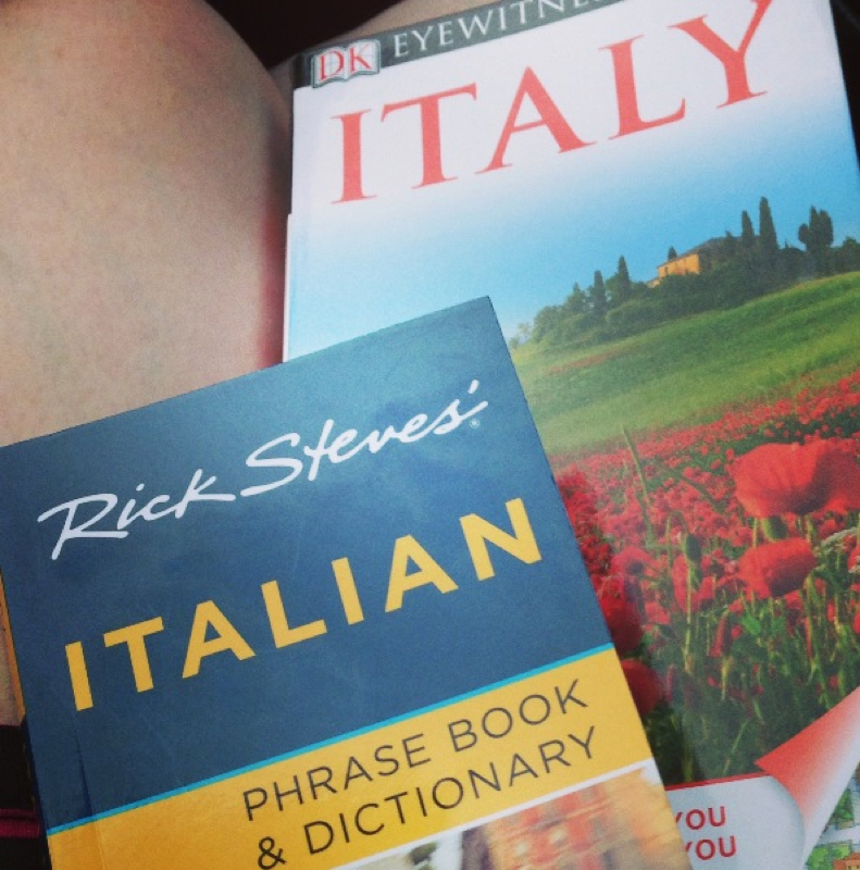
We leave for Italy in 12 days! Ahhhhhh! So excited! I've been getting everything ready to be packed and I can't wait to be stepping on the plane to Italy! I have already purchased my guidebooks and I've been planning what supplies I want to bring. I just can't wait to be eating gelato on the Spanish Steps in Rome and it will be here sooner than I think!
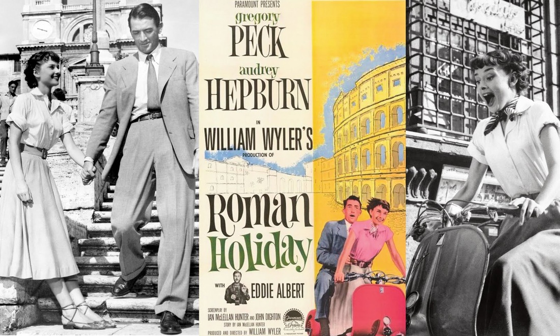
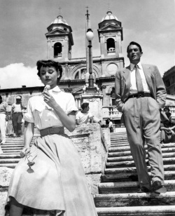 I recently watched Roman Holiday on Netflix, and It made me even more excited about visiting Italy. Seeing places that I will be makes me even more excited, and places that I already recognize from the photos, like the Spanish Steps on the left. Oh how I would love to be eating gelato on the Spanish Steps with Audrey Hepburn.. Which are the widest steps in Europe! Another of my favorite scenes is when Princess Ann falls asleep in front of the Roman Forum. All the History! I can't help but think that most of these places, and most of the artwork we will see, is older than America!
Only 24 days until we are in Italy! I can't wait to be surrounded by the history and beauty of Rome, Florence, and Venice. Gathering supplies for this trip has been half the fun, and I can't wait to be inspired when I'm surrounded by the most recognized and influential artwork around the world!
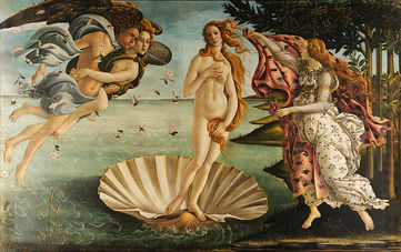 Boticelli's The Birth of Venus in the Uffizi - Florence 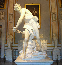 Bernini's David in Galleria Borghese - Rome 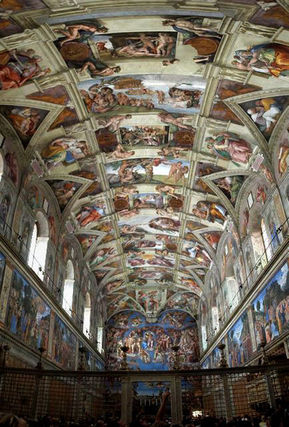 Michaelangelo's Sistine Chapel Ceiling - Vatican City
|

 RSS Feed