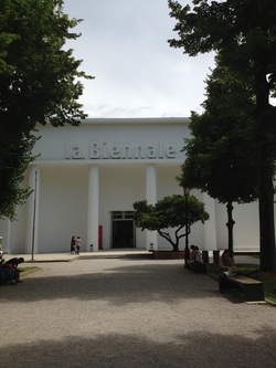
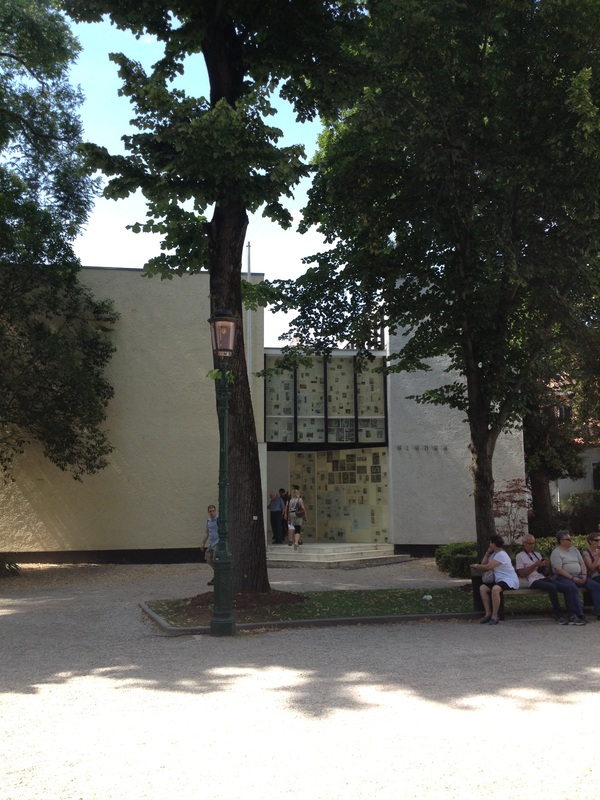
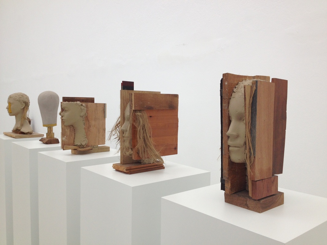
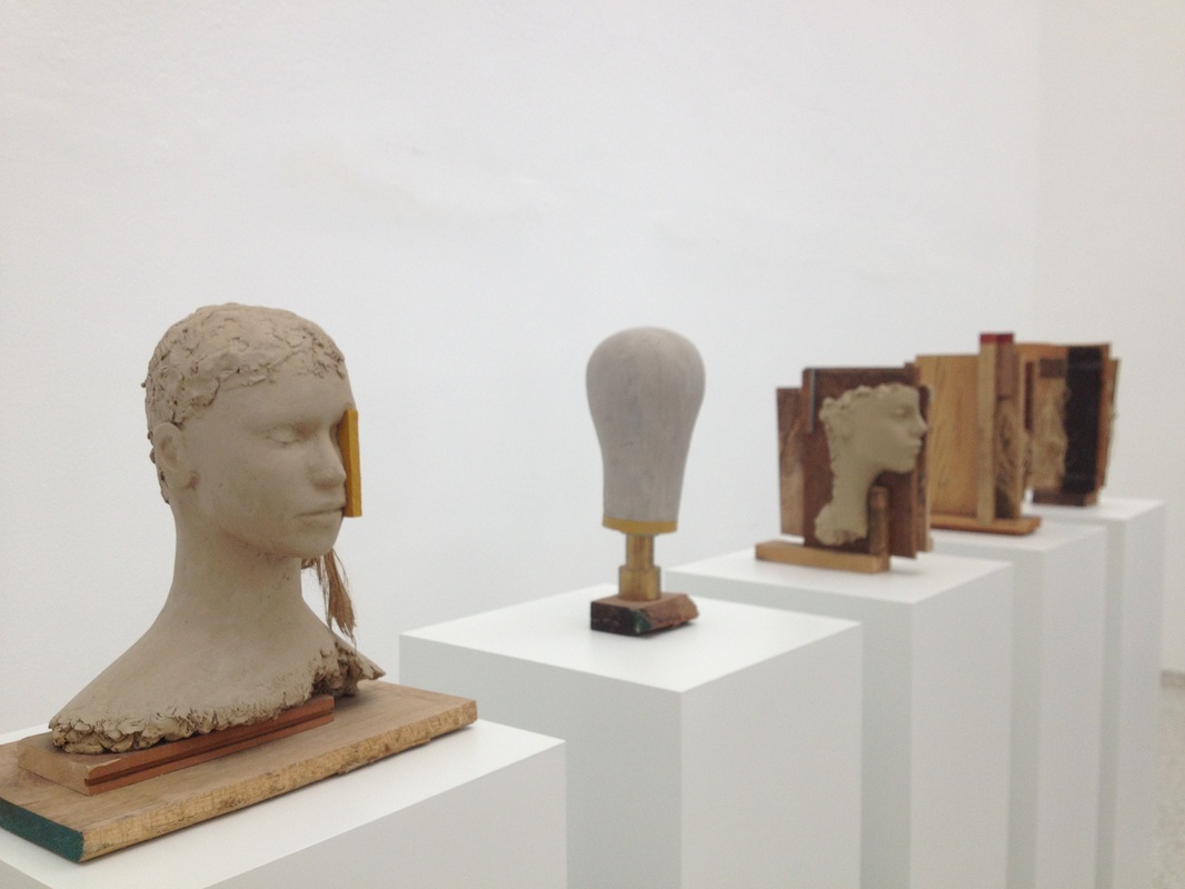
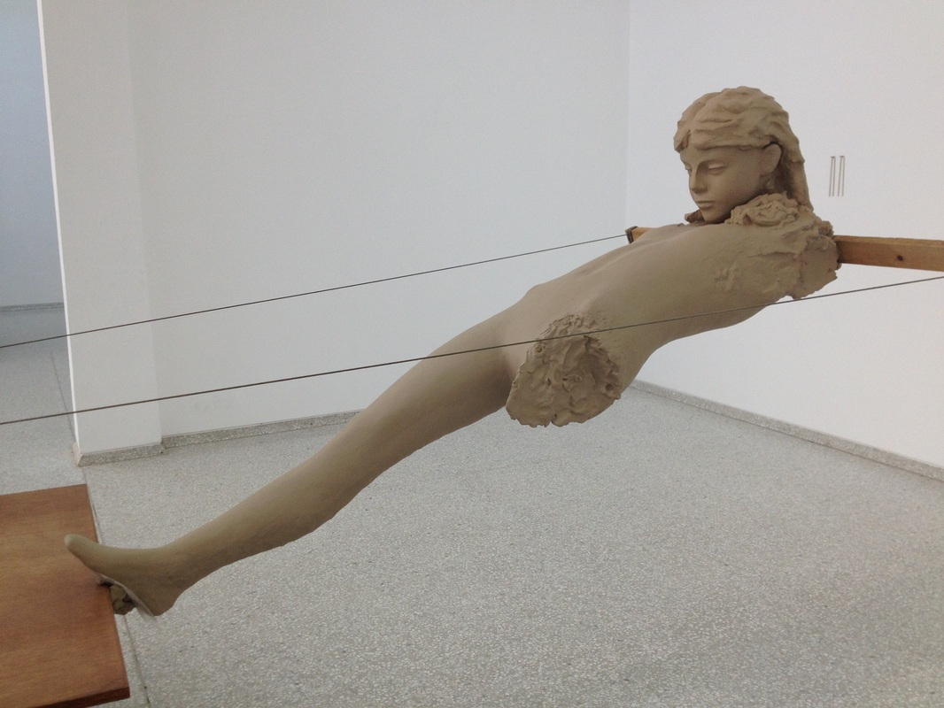
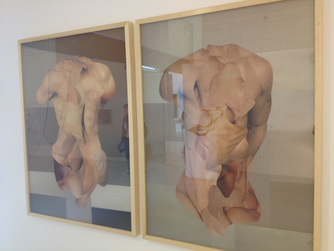
This morning was a delight. We had tea and juice brought to our room this morning as well as some bites to eat. First place we went to was Piazza San Marco and Basilica San Marco and then to la Biennale di Venezia. Well, we couldn't focus on the art on an empty stomach, so Emily and I grabbed something to eat. I had Tramozzino con Prosciutto cotto e funghi, which is Italian for ham and mushroom sandwich I suppose. My favorite part of the Biennale was the cafeteria. The walls had a lot of contrast (black & white) and there was a lot of abstraction going on as well.
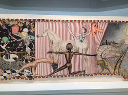
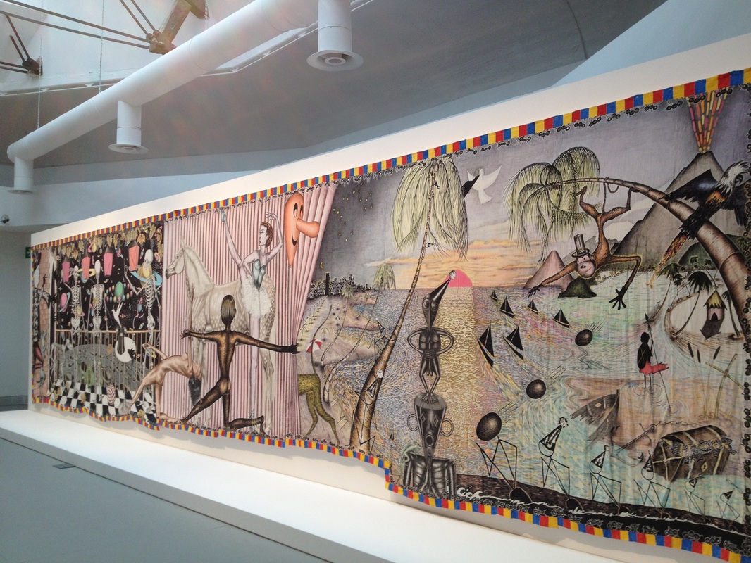
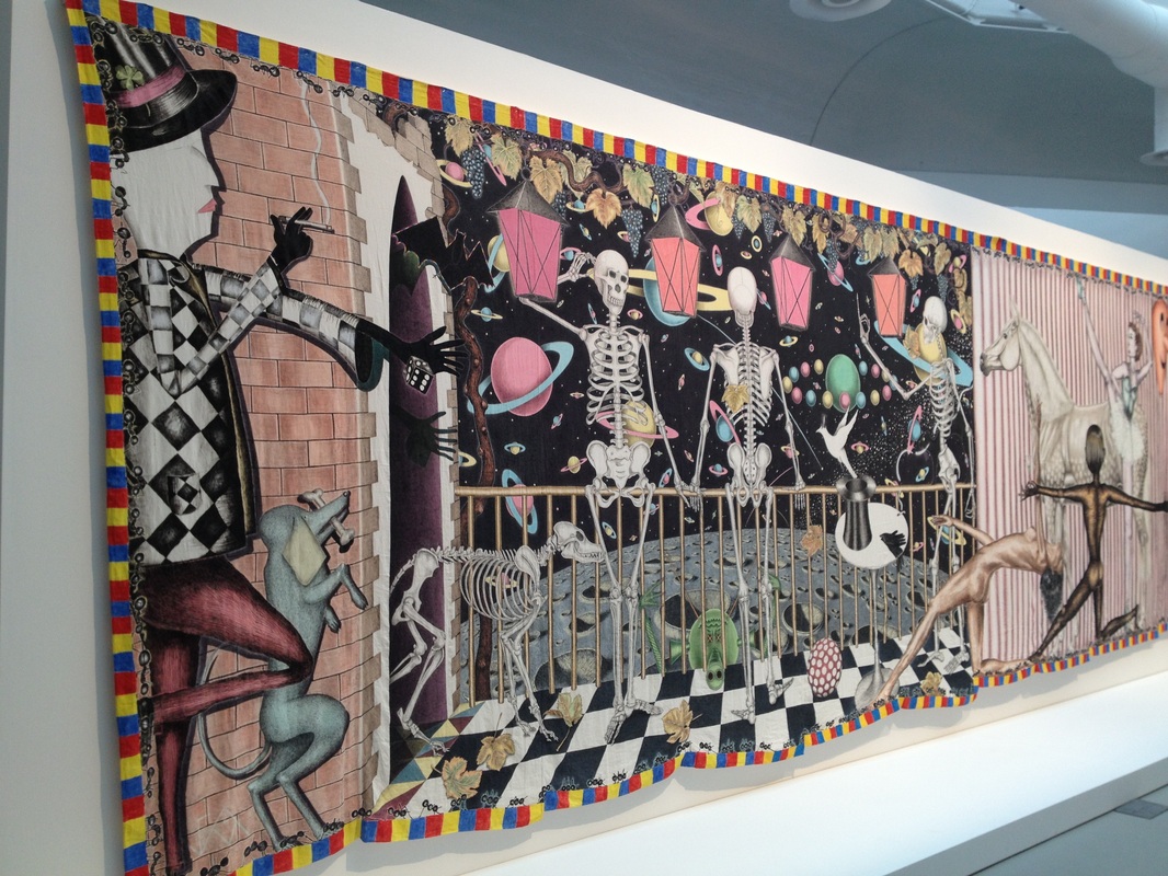
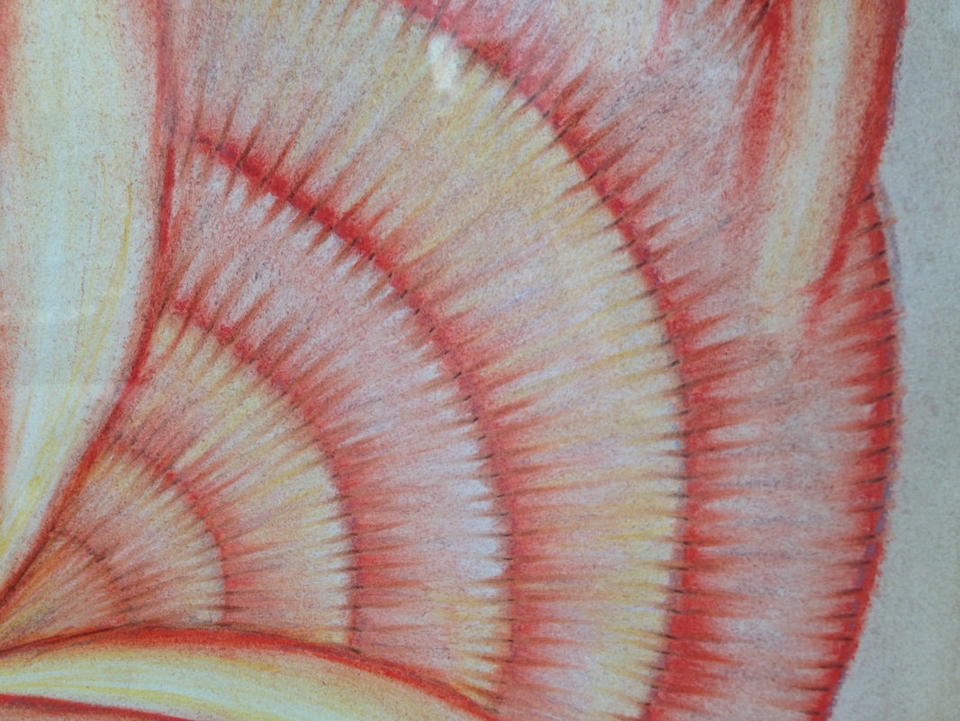
Jean Frederic Schnyder: Apocalypso, 1976-78
After that, we took a tour around and looked at a few artist
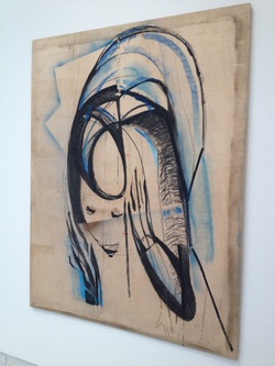
such as Jean Frederic Schnyder, who created a piece called Apocalypso, which caught my attention. The form of his work is a painting; he used oil, textile and watercolor on linen. The rest of his works done with oil on canvas. The work unfolds a peculiar story of images, which is divided into three principal scenes. Skeletons standing by a railing, gesticulating, watch colorful planets pass by, while in a circus scene, a black nude lifts a curtain, revealing a staggering tropical scenery (research). There is a variety of colors that move your eye all over the artwork.
The detail in his work was inspiring to me. For example, the color he chose, which was a lot of dark and light colors which added a lot of contrast. The scale of the piece took his work to another level. I feel that if the piece was smaller it wouldn't have been effective because there was so much detail. The more I studied the piece that more I tried to figure out what the artist was trying to communicate. From my point of view, the doves could symbolize the beginning and the end as well as the stick figures could symbolize chanting and escaping the apocalypse, or the before and after of the apocalypse in his mind. Overall, this piece was one of my favorites from the Biennale with the whole concept, the details, the colors, and the placement of everything.


Marisa Merz: Senzsa Titolo, 1981-82
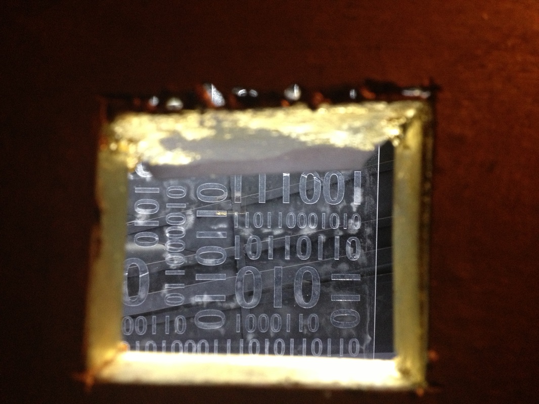
Mixed media on paper, copper wire, iron frame, 180 x 140 cm. Maria Lassnig, born in Kappel, Austria, in 1919, has always been focused on self-portraiture. Her early works are highly expressionistic and rooted in early 20th-century figurative traditions as well as the treatment of the body used by the Viennese Actionists. In recent years she has become known for her self-coined “drastic paintings.” In 1980, Lassnig exhibited in the Austrian Pavilion at the Venice Biennale; she has also participated in two editions of Documenta, the 8th Gwangju Biennale and in many important group and solo exhibitions (http://lucyreesart.com/2013/07/10/illeone-doro/). I think the artists focuses on the expression in the piece. Even though there is only one color, it is effective for the simple fact that there are different shades of blue in certain areas. There is a variety of lines, which I think adds more depth to the piece. The thickness of some lines make it stand out more. The little area of texture that is to the right of her head create its own movement and mimics some of the shading in other areas such as the top of the head. The hands in this picture create more meaning to the piece. For example, the viewer can associate the hands with the facial expression and relate them to one another. The negative space that is used for the background makes the piece dominant, if there was another color added to the background it may take away from the piece. The piece is a good work of art for the simple fact that the way the lines are used to create focal points in certain areas.
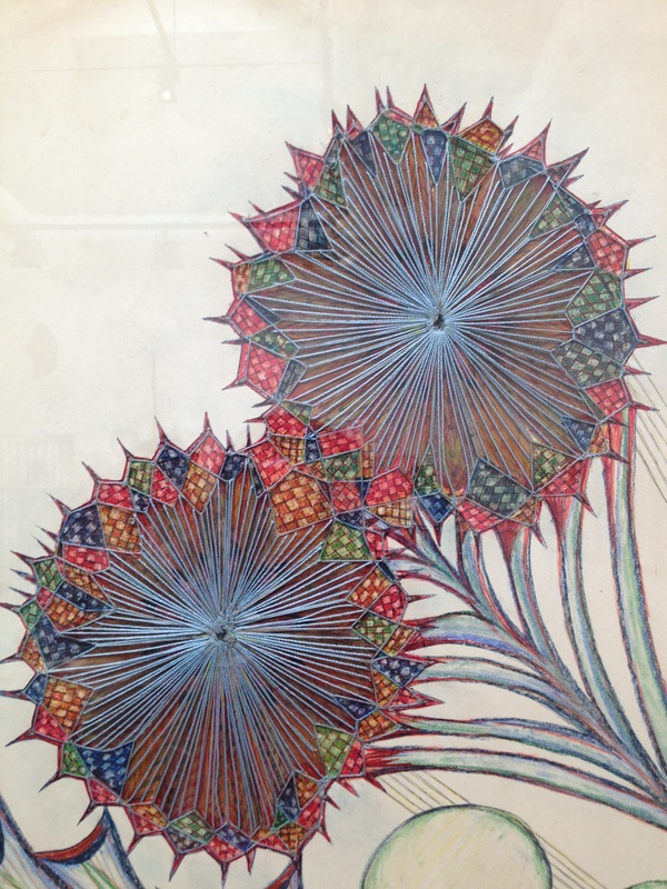
Anna Zemankova: Untitled works, 1960s-1970s
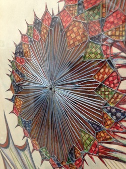
Working in the pre-dawn hours between four and seven o’clock, Anna Zemánková found solace in art, creating floral and botanical drawings that served as a brief respite from the duties of her regular life. It was during these hours of solitude that she created, as she said, “I am growing flowers that are not grown anywhere else. ” (http://www.petulloartcollection.org/thecollection/about_the_artists/artist.cfm?a_id=65) Looking at the body of Zemánková’s work distinct periods can be seen. Her early drawings were done on large sheets of paper, featuring botanical or organically inspired pieces, often done in pastel or oil pastel. The technique that she uses is interesting. It adds a lot more character to the art. I think the blue string strengthens the piece and brings it together. The way she took a different approach to flowers can change the way viewers look at flowers visually. Eventhough there is so much going on with the top of the flower everything from the patterns to the lines unifies the flower as a whole.

Lynette Yiadom-Boakye
The little colors in her work, really bring out the piece while everything else isn't as dominant. Below is video of Lynette Yiadom-Boakye talking about her work (youtube). And get this!...she does all of her work in ONE DAY, that really makes me think that when I work on an art project I really need to appreciate and use all the time that is given to me. Since she can dedicate herself to create beautiful artwork in one day, so can everybody else. Not only does she focus on the people, but on the body languages and she brings those positions to life whether it is the color she chooses or where she decides to put the color to grab the viewers attention.

Varda Caivano
Domenico Gnoli


Cathy Wilkes
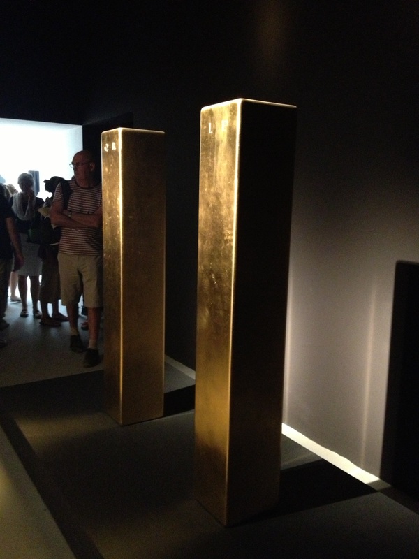
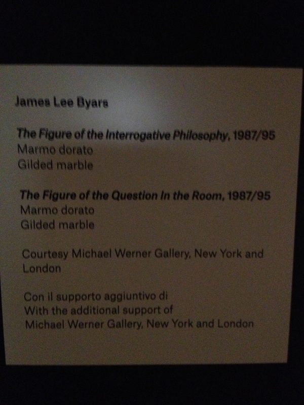
James Lee Byars
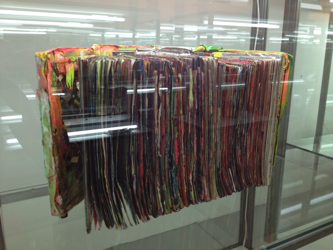
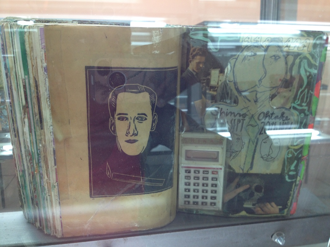
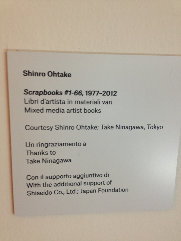
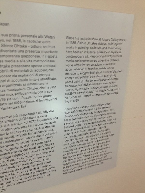
Shinro Ohtake


Artur Zmijewski
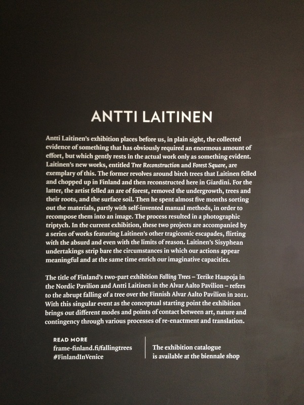
Antti Laitinen

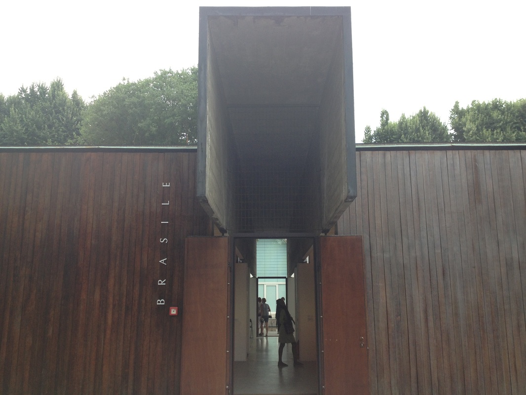
Brasile
Egitto


Mathias Poledna
I found my artist that I was looking for!! The piece explores the relationship between art and entertainment; modernity in
architecture and design; the language of film; and the connections between film and the process of creating the image in contemporary culture (http://www.domusweb.it/en/art/2013/06/6/mathias_poledna_imitationoflife.html). Seeing her artwork in person was so amazing to me. When I watched animation, I know that my face lit up like a kid on Christmas day. I love animation and because her animation relates to life is a big deal to me. Other cartoons now relate to goofiness, funniness, and other characteristics, but hers makes a point. Not only did her art capture my attention because it was a cartoon, but it had movement from the bird swirling down and approaching the donkey in a sailor suit. There is a certain dominance with the picture in the front and the background. For example, when there is a focal point such as the donkey, everything else in the back ground is either fuzzy/dull, or does not standout as much as the other objects in the film. Rhythm is carried through out the film as well, not so much related to art, but to music, but it can still relate to art in some kind've way.
architecture and design; the language of film; and the connections between film and the process of creating the image in contemporary culture (http://www.domusweb.it/en/art/2013/06/6/mathias_poledna_imitationoflife.html). Seeing her artwork in person was so amazing to me. When I watched animation, I know that my face lit up like a kid on Christmas day. I love animation and because her animation relates to life is a big deal to me. Other cartoons now relate to goofiness, funniness, and other characteristics, but hers makes a point. Not only did her art capture my attention because it was a cartoon, but it had movement from the bird swirling down and approaching the donkey in a sailor suit. There is a certain dominance with the picture in the front and the background. For example, when there is a focal point such as the donkey, everything else in the back ground is either fuzzy/dull, or does not standout as much as the other objects in the film. Rhythm is carried through out the film as well, not so much related to art, but to music, but it can still relate to art in some kind've way.
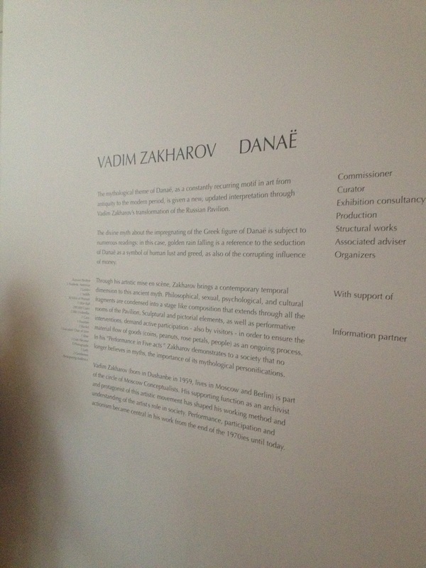
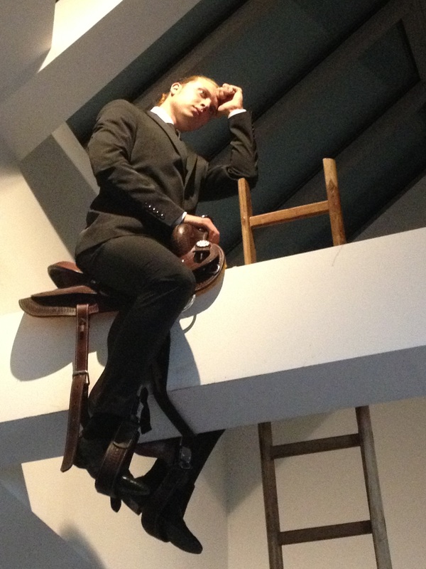
Russia
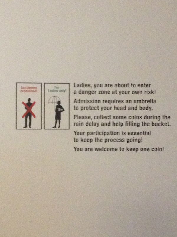
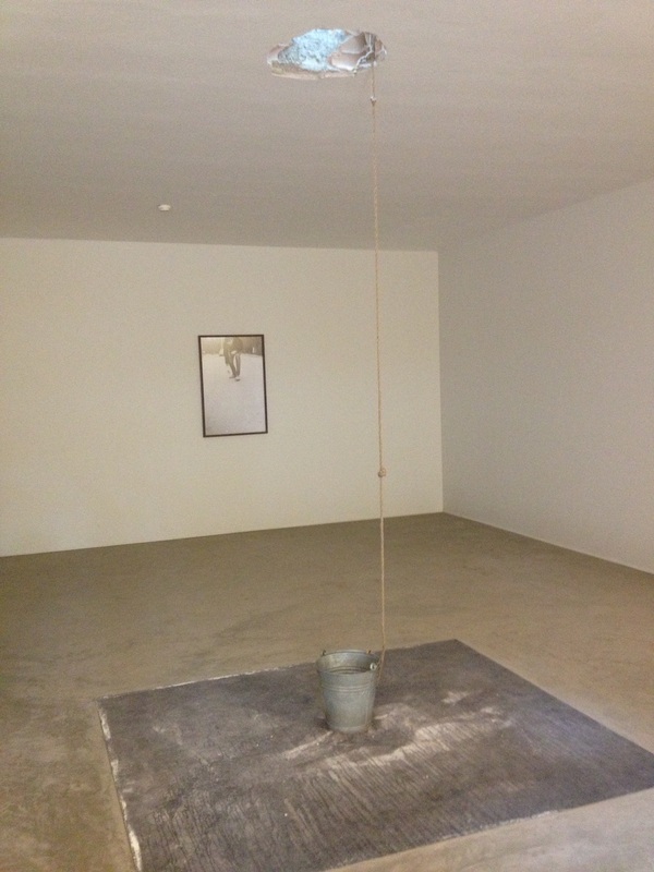
Not all of art has to be colorful or have lines. Some art just can have a purpose, such as Russia. It was a little sketchy going in there with coins dropping everywhere (and coins hurt too). I almost went in there with no umbrella..tragic. The lady explained the whole concept of what was about to happen and the purpose. Men were not allowed to go and pick up any of the coins only women. Women were allowed to keep one coin and then put the rest in the bucket. A coin was for good luck if I can remember. Still to this day I do not know what the sayings on the wall meant. I did not know if women picking up the coins and how much they picked up were to relate to the bags on the floor and the quote that related to that. I assumed that the quotes may relate to the men because there was a guy sitting on a sattle picking peanuts. The quote in the picture below I believe relates to the man at the top of that ladder, and possibly that last quote relates to the gentlemen in the room standing beside the coin machine. Also, they did a good job on picking those guys by the way, they were very nice to look at. ;-)
The first Moscow Biennale of Contemporary Art, initiated by the Ministry of Culture of the Russian Federation, marked an important step forward in the process of reintegrating contemporary Russian art into the international art world. The Moscow Biennale intends to be not only a great event in the artistic life of Moscow and Russia but also to play an important social, cultural and political role internationally (http://www.biennialfoundation.org/biennials/moscow-biennale/).
The first Moscow Biennale of Contemporary Art, initiated by the Ministry of Culture of the Russian Federation, marked an important step forward in the process of reintegrating contemporary Russian art into the international art world. The Moscow Biennale intends to be not only a great event in the artistic life of Moscow and Russia but also to play an important social, cultural and political role internationally (http://www.biennialfoundation.org/biennials/moscow-biennale/).


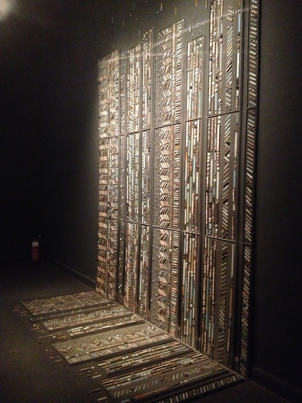
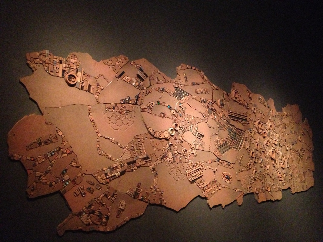
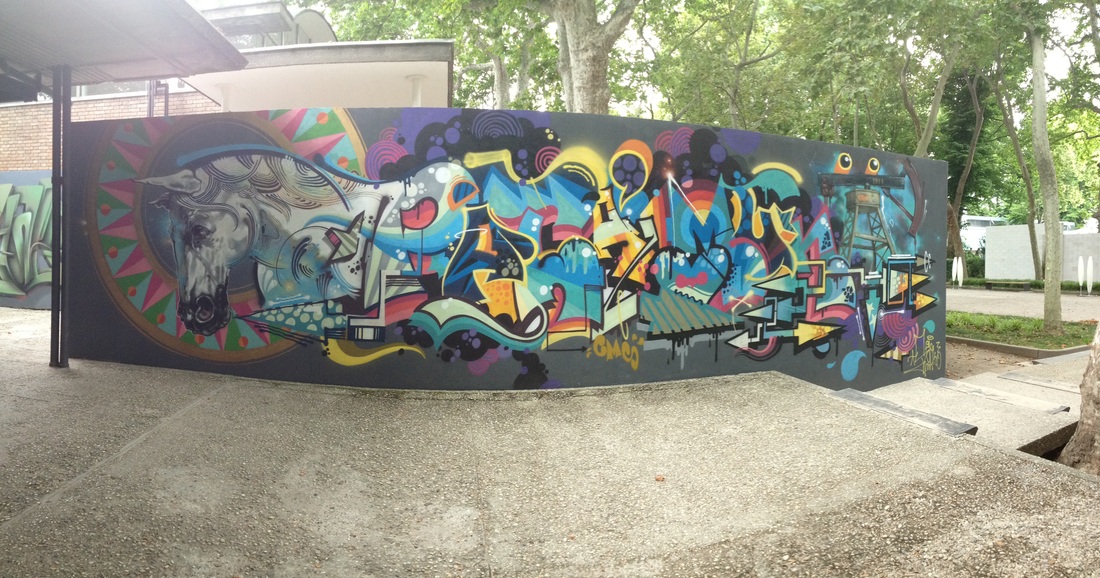
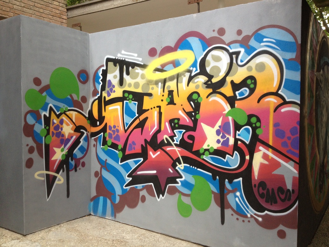
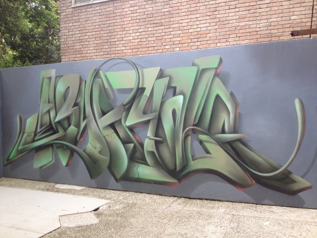
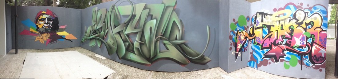
Venezuela
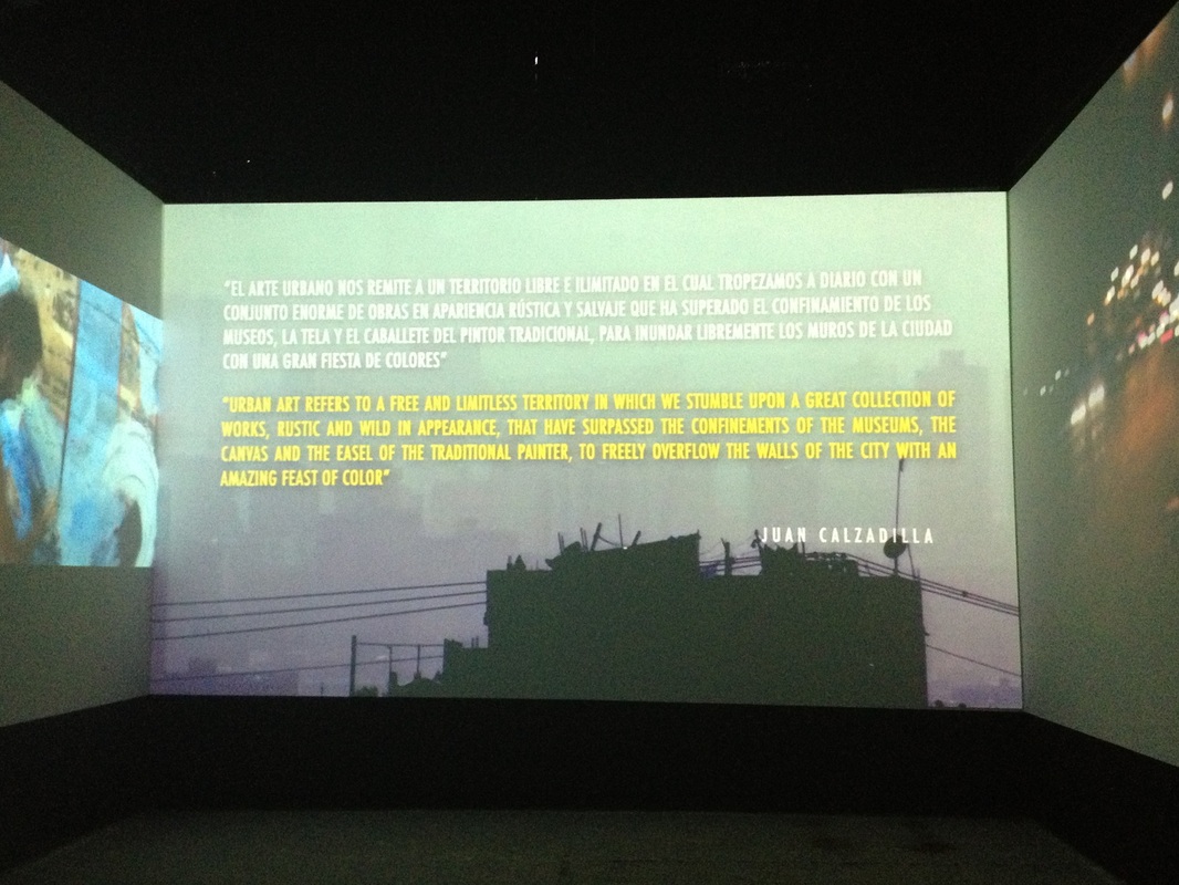
Venezuela was one of my favorites. The graffiti type art on the walls. It created a sense of expression in the piece. The lines are very curvy which keep your eye moving around the piece. Because the colors are so dominant and the line work is so dominant they go hand and hand together very well. The work on the wall has a three dimensional effect, even in the video hat you will see below has the same effect. The type of media that was used I guess was spray paint. The video has the same effect on me as the animation did with Mathius Poledna. Anything with color and movement is an attention grabber for me. A series of solo exhibitions, give him a chance to present their own work in Italy and abroad. Entre ellas podemos mencionar la del Museo de Arte Moderno de Nueva York en 1966, en Venecia en 1968, Vicenza, Londres y París en 1974 y Madrid en 1978. Among them we can mention the Museum of Modern Art in New York in 1966, in Venice in 1968, Vicenza, London and Paris in 1974 and Madrid in 1978 (research).


 RSS Feed