I really enjoyed Marisa Merez at The Central Pavilion and can not wait to see it up close at the Biennale. I think with her use of muted color schemes, line variation, directional movement and symmetry, Marisa Merez does a great job at transforming two-dimensional lines into images that are stylized. I think I even noticed the use of a stencil in one of her pieces which adds a great deal of contrast compared to the pencil.
Walter De Maria's exhibit I think focuses on the perspective of the viewer and scale. It is non-representational and linear. I think the gold bars contrast well with the room they are in. There must be something significant about the number of bars are lying on the floor. Even the negative space between the bars are consistent. By positioning the bars on the floor I think the artist was trying to emphasize the heaviness of the bars.
Varda Caivano creates compositions filled with strong directional brush strokes, and color to unify her pieces. Caivano makes excellent use of the entire picture plane. Carefully peeking through are the whites of the canvas that add depth and harmony to form organic shapes. To me up close is where you notice the bold texture made by drips and the washed out translucence of the media.
With Enrico David at the Central Pavilion I would be interested in seeing what the back of his stitched pieces looked like. His use of a textile material leads me to think about the significance of the texture. The organic patterns and contrasting colors form three-dimensional images. The repeating shapes adds harmony to the textile pieces.
Sarah Lucas could have used molds or casting to make these figures. They become expressive because of the recognizable body language and contrast in smooth and rough surfaces. Some figures are also sensual in context. They have exaggerated phallic and ionic features. As a whole body of work I think these pieces are aesthetically pleasing and purely sculptural.
There is something extremely monumental about James Lee Byars exhibit. It is comparable to Maya Lin's Vietnam Memorial. The two pillars are representational of grave markers. The use of gold relates to the importance of the initials engraved on the pillars.
Carol Rama's work gets shockingly personal. You're initially drawn in by the different frames and smaller proportioned pictures. Her media looks like water color and ink on colored paper.
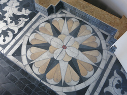
Katrín Sigurdardóttir at The Icelandic Pavilion Is my one of my favorite artists at the Biennale. She created a moveable platform that is the traditional design of 18th century pavilion using art materials instead of flooring materials. That decision was made to keep in the mind of the viewers that not only is this piece intricately ornamental it is still sculptural. I enjoy the fact that her viewers are able to interact with her work. Her piece is representational of the past. She based her shapes, design and pattern off of baroque patterns. Her use of minimal color gives viewers a focal point and her line work provides movement. the repeated shapes and colors unifies the piece. Viewers can clearly tell the importance of the piece by its specific location. Adding colors to certain areas brings attention to the balance within the piece. A common theme with Katrin Sigurdardottir's works is full viewer and art interaction.
I believe her art is functional because we are meant to associate with it not just view it.

 RSS Feed